Custom Slab Typeface for NRK
Sans to slab: extending an existing identity rather than starting over
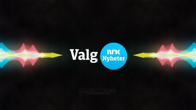
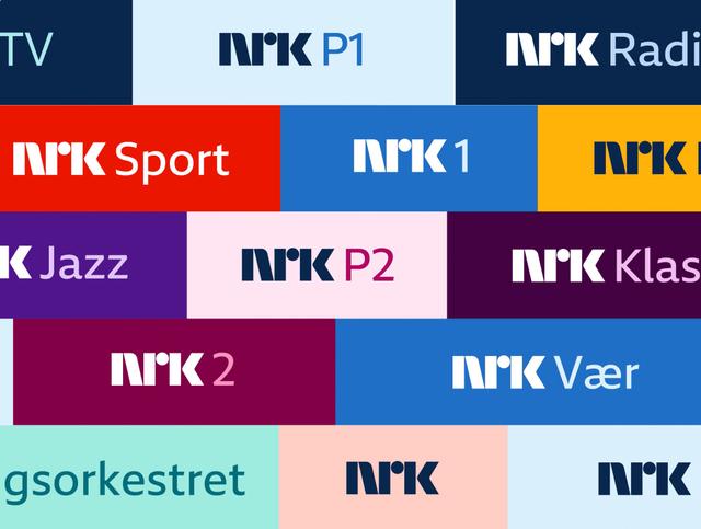
Norwegian public broadcaster NRK commissioned TypeTogether and Leftloft to develop a slab companion to LFT Etica, which had anchored NRK's 2010 visual identity. The brief called for a condensed starting point to address LFT Etica's generous width, with the slab intended primarily for the Nyheter and Sport channels across web, TV, and channel logotypes. Three concept directions were differentiated by serif construction, terminal shape, and alternate letterforms; all teams selected the third option as most open and approachable. The two resulting weights—NRK EticaSlab SemiCondensed Book and Bold—are deployed alongside LFT Etica for headlines, graphics, and hierarchy support.
Set in NRK EticaSlab SemiCondensed, LFT Etica
Insights
- The condensed starting point (LFT Etica Condensed Semi-Bold and Book) was chosen specifically to counteract LFT Etica's wide default proportions.
- Stem thickness and vertical proportions were held constant from the sans to ensure the slab read as a complement rather than a competing voice.
- Three initial concepts were distinguished only by finer variables—serif construction, terminal shape, and alternate 'a' and 'g' forms—keeping the exploration tightly scoped.
- The original Leftloft designers participated directly in the first design stage, using NRK-specific words (Nyheter, Urix, Ytring) as the test set.
Related articles
1 / 6Swipe
Keep exploring
Related cases