Custom Logotype for NRK
Why typing a font can never make a logo
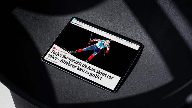
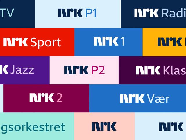
In 2014, Norwegian public broadcaster NRK commissioned TypeTogether to design a custom typeface for its new visual identity. Alongside the typeface, TypeTogether refined NRK's circle logo for two channels—NRK Nyheter and NRK Sport—integrating the new typeface with the established NRK lettering. The project required a three-tier logo hierarchy, with letterform adjustments distinct from the underlying typeface design. Multiple output contexts—billboards, business cards, offset and laser printing, and varied screen resolutions—required different logo versions to meet technical demands.
Insights
- Logotype letters required individual shape adjustments beyond the custom typeface—for example, the 'r' terminal in 'Nyheter' was straightened and the 't' crossbar in 'Sport' was cut to match the 'r' angle.
- Balancing the two circled channel logos was complicated by differing word lengths; 'Nyheter' and 'Sport' could not share the same point size yet needed equivalent apparent weight, requiring stem thickness and letter-spacing fine-tuning.
- The secondary logo underwent several rounds of feedback and alterations to resolve the visual balance between the channel name, the NRK symbol, and the two circled logos relative to each other.
- Artwork was required in multiple versions for large-format print, small-format stationery, offset and laser printers, and both high- and low-resolution screens.
Related articles
1 / 6Swipe
Keep exploring
Related cases