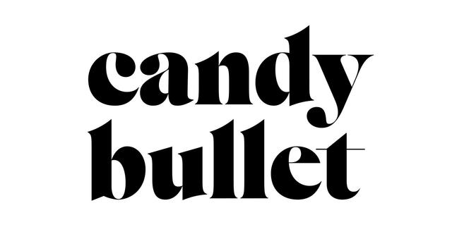
TheW
Monospaced display logic adapted into a Didot text face
TheW is a type family by Ian Party / Swiss Typefaces, divided into two collections: TheW Clan, comprising three display styles with a monospaced look (RZA, GZA, ODB), and TheW NYC, a proportional text subfamily rooted in the Didot genre. TheW NYC was initially developed for Sport&Style magazine under the creative direction of Régis Tosetti and Simon Palmieri. Font engineering is credited to Christoph Koeberlin.
Set in TheW
Insights
- RZA, the founding style, selectively honors monospacing constraints—caps are tight, 'i' gains extra air—while 'm' occupies the space of two characters, breaking the grid deliberately.
- GZA retains selective serifs at bases and triangular tops rather than committing to a full sans, with asymmetric solutions such as a 'T' carrying serifs of unequal length.
- ODB counters its vertical emphasis with double-wide glyphs for the question mark and long dot-bars on 'i' and 'j', and departs from true monospacing on individual characters such as 'G', 'r', and 't'.
- TheW NYC transfers specific RZA details—straight bottom serifs, a maverick 'g' weight placement, and bold mid-bar treatment on 'E'—into an otherwise conventional condensed Didot structure, then extends the same black-value logic to figures '3' and '5'.
Related articles
1 / 6Swipe
Keep exploring
Related cases


