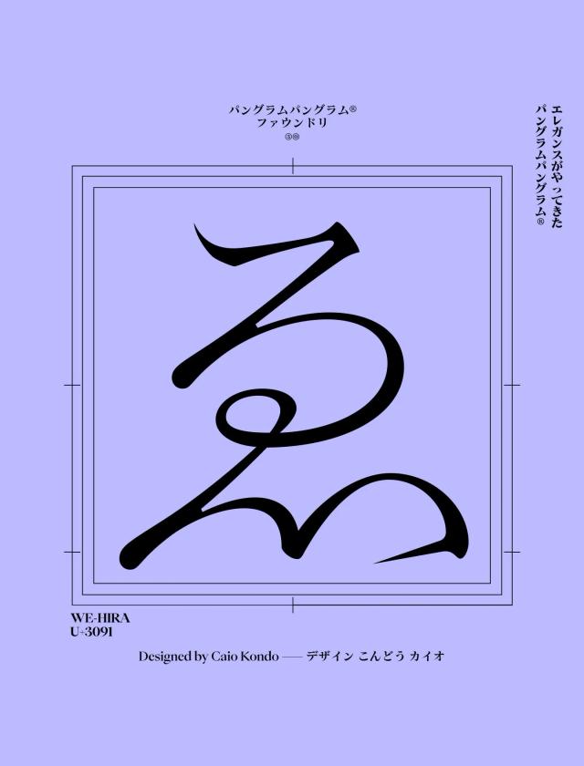
Typeface Design for PP Kyoto
A slab serif that grew from years of studying Japanese scripts
PP Kyoto is a slab serif type family that began as a study of Japanese writing systems, exploring how a Latin slab serif could visually connect with hiragana and katakana. The design matured over several years before arriving at its current form. It spans 9 weights from Thin to Heavy, each with matching italics, and covers 692 glyphs including full hiragana, katakana, Japanese punctuation, and stylistic alternates.
Set in PP Kyoto
Insights
- The typeface originated as a study of Japanese writing systems, with that exploration directly informing its design.
- Bold slab serifs are paired with soft teardrop terminals and prominent dots to create rhythmic contrast within letterforms.
- Bilingual support includes a considered set of Japanese punctuation alongside full hiragana and katakana for multilingual layout use.
- The design spent years on the shelf, developing through trial and error before release.
Related articles
Keep exploring
Related cases


