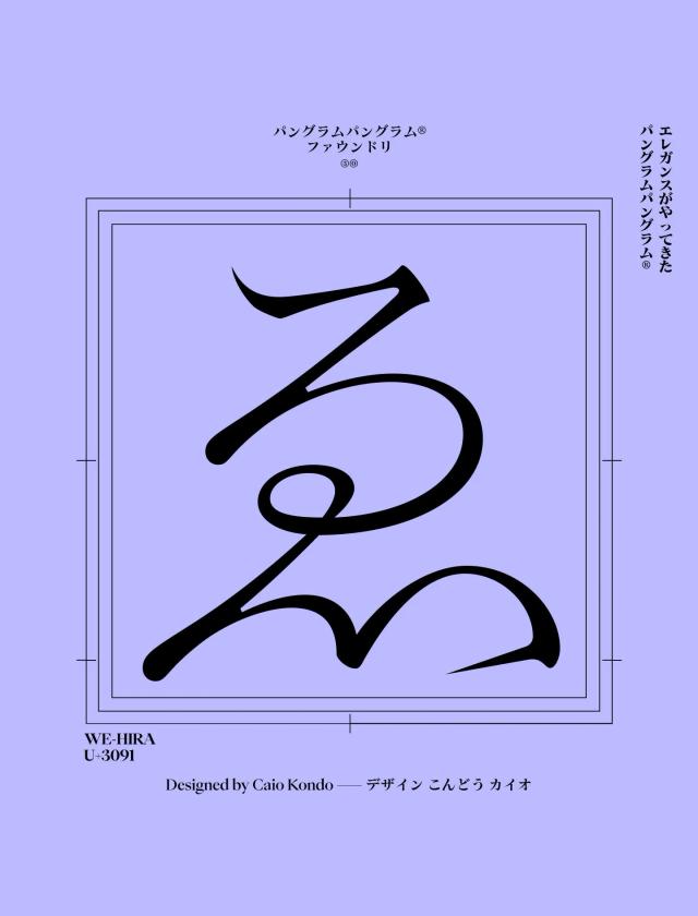
Type Design for a Japanese American Immigration Tribute
Five typographic systems, one historical thread
PP Nikkei is a type family created as a tribute to Japanese immigration to America, drawing on the visual heritage of Nikkei communities. The design synthesizes sources including ship hand-lettering, Nikkei community newspapers, and Japanese family crests. Five distinct typographic systems were developed, each expressing a separate concept while sharing a unifying historical narrative. The family is intended for titling use, with proportions and stylistic alternates that support varied compositional arrangements.
Set in PP Nikkei
Insights
- The family comprises five separate typographic systems, each conceptually distinct but bound by a shared cultural narrative.
- Reference materials span three source categories: hand-lettering on ships, Nikkei community newspaper typography, and Japanese mon (family crests).
- Proportions and stylistic alternates allow for playful title composition options.
Related articles
Keep exploring
Related cases


