Brand and Packaging for Sugar POP Cosmetics
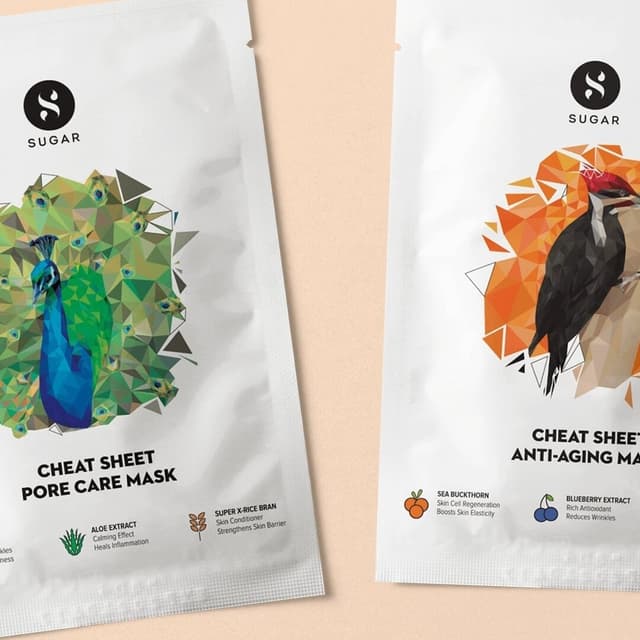
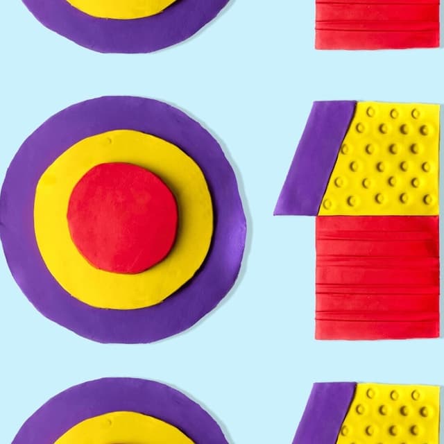
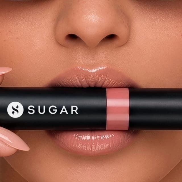
Opposite created the brand and packaging design for Sugar POP, an affordable color cosmetics line from Sugar. The design uses a minimal layout and a bold, vibrant color palette to stand out in crowded retail environments while remaining aspirational within its price range. The solution balanced strong shelf presence with tight production budgets through efficient single-color printing.
Keep exploring
Related cases