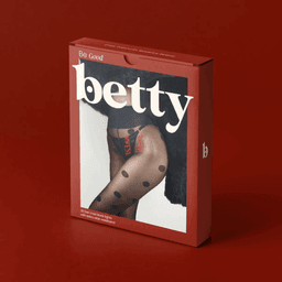
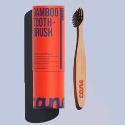
Noramble
Noramble is a Manchester-based brand and packaging design studio that helps businesses stand out by rebelling against category clichés. Founded by a designer driven to challenge sameness in the marketplace, Noramble partners with start-ups and global brands alike to create distinctive identities that drive commercial growth. Their process focuses on true differentiation—giving consumers a reason to notice, choose, and care. Known for a bold, strategic approach, Noramble delivers design that not only looks good but performs effectively across brand touchpoints, helping clients build memorable and commercially successful brands.
Works with Thrillers, Apex New
Their own site is set in Poppins, Saans
Cases
- 10X Athletic
- Packaging Design for 10X Athletic Gummy Range
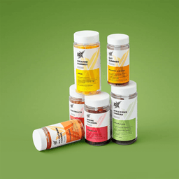
- 10X Athletic
- Packaging Design for 10X Athletic Gummy Range
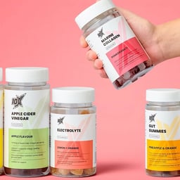
- 10X Athletic
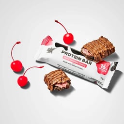
- Packaging Design for 10X Athletic Protein Bar
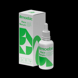
- Amoebic
- Brand and Packaging Design for Amoebic Skincare
- Betty Tights
- Packaging Design for Betty Tights
Key people
Designers and creative leads attributed to Noramble in press coverage.
News & interviews
Clients
Tech Stack
Technologies detected on Noramble's website.
Cloudflarehosting
Google Analytics 4analytics
GSAPother
ScrollTriggerother
Swiperother
Alpine.jsother