Visual Identity for Lacoste
Lacoste’s biggest redesign barely touched the crocodile.
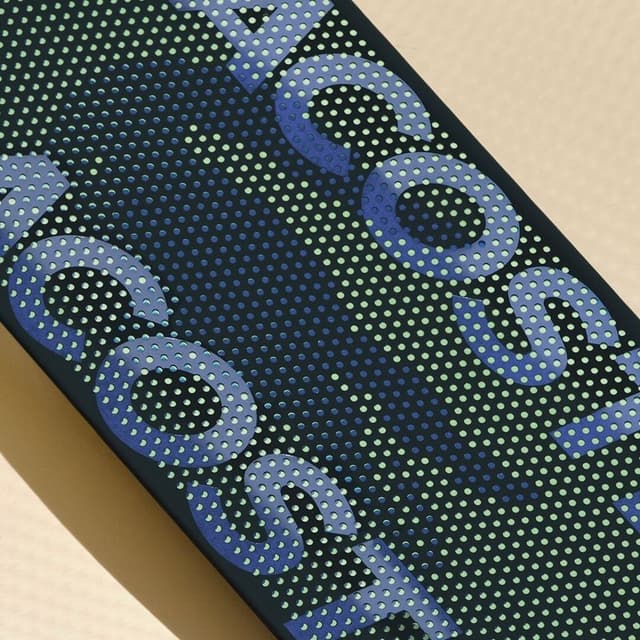
Commission Studio created a new visual identity for Lacoste in April 2026, its first in roughly 15 years. The crocodile was not redrawn but given more room and a more visible red tongue; a custom condensed serif replaced the previous sans, and the palette was extended with clay and farine tones drawn from the brand's own history.
Insights
- Lacoste's own research found that people knew the brand but often did not know it was French, so Commission Studio used the redesign to bring the house's origin story forward.
- Rather than redrawing the crocodile, the studio gave it more space, enlarged it in applications, and made the original red tongue more visible; the green was recalibrated against the historical colour.
- The typography changed from the previous sans-serif (used since 2011) to a custom condensed serif drawn from the archive, a choice that some critics saw as trend-driven for a brand as iconic as Lacoste.
- The palette was extended into biography-driven tones: three greens plus clay, referencing clay tennis courts, and farine, the colour of René Lacoste’s first blazer.
- The identity also uses René Lacoste’s own handwriting in some applications, literally reintroducing the founder; that fits the brand’s origin story, from the 1923 Boston suitcase bet to Lacoste’s role as a Grand Slam champion and inventor of the modern polo shirt.
Keep exploring
Related cases