Le Jeune
Ball terminals distinguish Le Jeune from the Didot mainstream
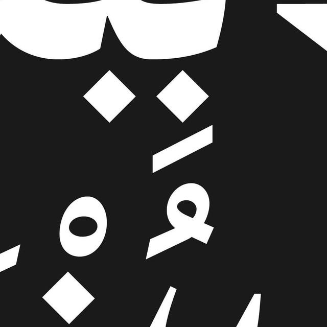
Le Jeune is a contemporary adaptation of the French Modern (Didot) serif tradition, designed by Paul Barnes and Christian Schwartz for Chris Dixon's refresh of Vanity Fair. Unlike typical French Moderns with soft teardrop terminals, Le Jeune uses sharp, round ball terminals characteristic of British and American Moderns. The family spans four optical sizes—from 6pt text to 200pt-plus display—with weight ranges tuned to each size. Greg Gazdowicz contributed a stencil variant across all optical sizes, referencing Modern-style stencil lettering historically found throughout France.
Set in Le Jeune
Insights
- Optical size differentiation governs weight availability: the largest sizes offer six weights (Light to Black), while the text size carries only four, dropping Light and Medium.
- Sharp ball terminals replace the soft teardrop forms typical of French Moderns, drawing instead on British and American Modern conventions.
- The stencil extension was inspired by Modern-style stencil letters historically prevalent in France, grounding a contemporary variant in archival reference.
Related articles
1 / 6Swipe
Keep exploring
Related cases