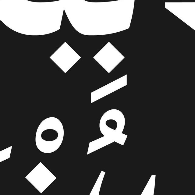
Caslon Italian Family
Stress inversion as a design premise
A revival of an 1821 Caslon typeface representing one of the stranger episodes in early 19th-century typefounding. The design inverts the stress of a fatface—thins become thicks and thicks become thins—producing an unusual optical effect. Original punches survive at St Bride Library. Unlike contemporaneous experimental styles, the Italian did not achieve widespread adoption and was rarely copied by other foundries.
Set in Caslon Italian
Insights
- The design reverses fatface stress distribution, swapping thick and thin strokes to create an inverted contrast.
- Caslon released the original in 1821; it remained a commercial outlier with little industry uptake.
- Revival is part of Commercial Type's Classics program, dedicated to recreating historical typefaces.
Related articles
1 / 7Swipe
Keep exploring
Related cases