← Back to Fonts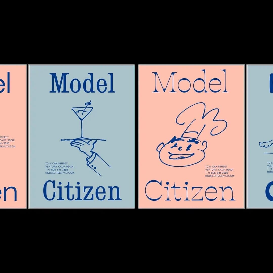
Hobo — 1 case
Used by Alter
Set for Model Citizen
Cases set in Hobo, as credited by the studios in their own writeups.
Hobo in the news
- Chris Chapman Revitalizes Agua de Madre Identity with Joyful Typography
The Brand Identity · Jun 10, 2025
Designer Chris Chapman reimagined the identity for East London-based water kefir brand Agua de Madre. The new branding embraces maximalist typography, nostalgic references, and vibrant color to capture the drink’s effervescent and joyful character. Retaining the original smiling ‘madre’ logo, Chapman balanced heritage with expressive modern design to stand apart from minimal health drink aesthetics.
Chris ChapmanAgua de Madrebranding - Agua de Madre Unveils Nostalgic Branding Celebrating Mother Culture
It's Nice That · Jan 6, 2025
The article profiles London-based designer Chris Chapman’s rebrand of Agua de Madre, a sparkling water kefir brand. Drawing on childhood nostalgia and the drink’s ‘mother culture’, the identity uses a mix of vibrant colours, eclectic typefaces, and sticker-like graphics to convey playfulness and taste. The result is a joyful, contemporary brand that stands out in the health drink market.
Adam&EveAgua de Madrebranding - The Designers: Actual Source’s Gunnar Harrison on research, personal projects and more
The Brand Identity · Jul 9, 2020 · Interview
The Brand Identity interviews Actual Source designer Gunnar Harrison about his path into design, the studio’s research-driven approach, and his personal projects. He discusses his bootleg typeface BedTimes, the Lake Effect project inspired by Utah’s Great Salt Lake, and the balance between client and self-initiated work. The conversation highlights Actual Source’s emphasis on research, production, and typographic experimentation.