← Back to Fonts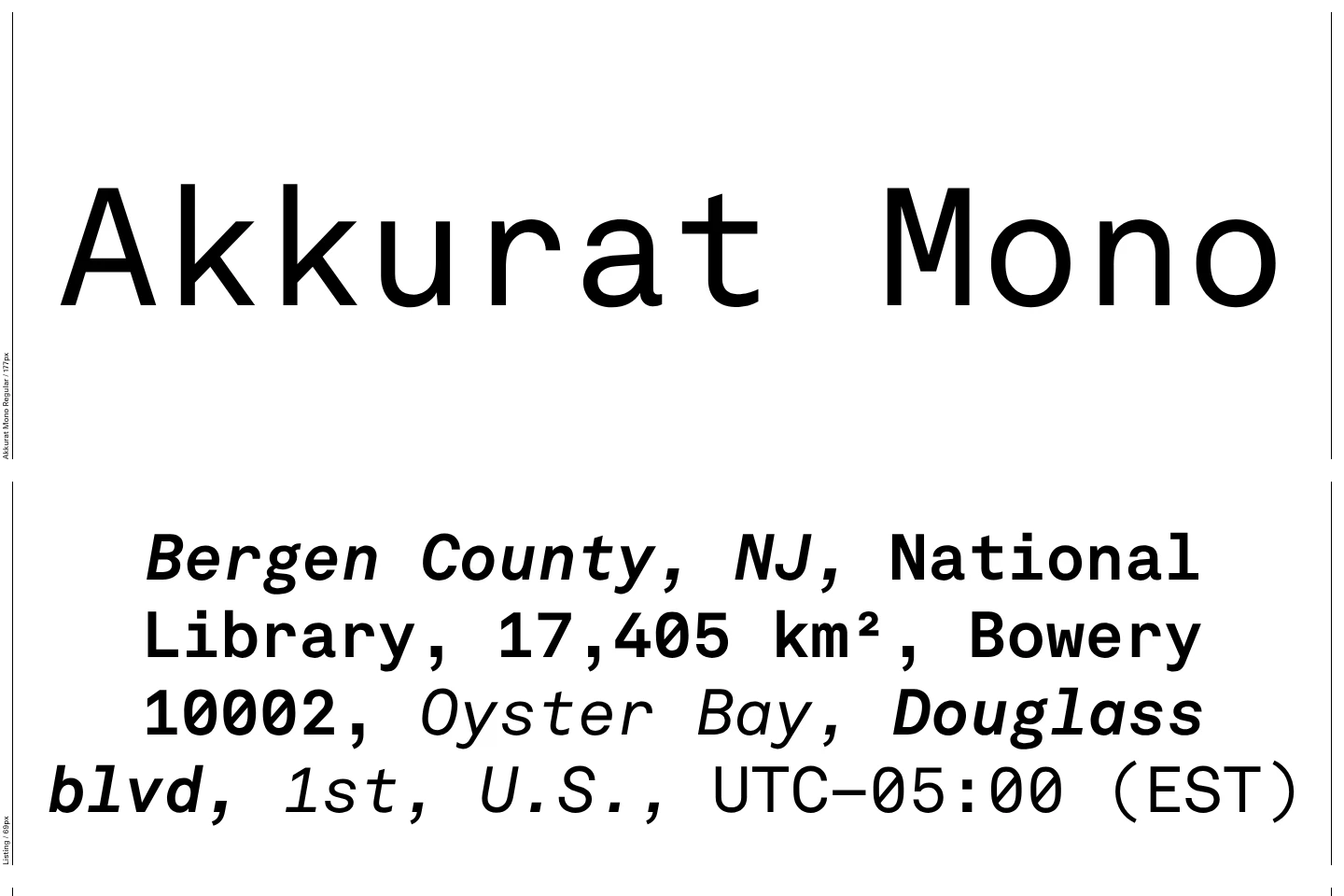
Akkurat Mono in use — 1 case
Used by Lineto
Set for Lineto
Find design references using Akkurat Mono. Browse project images and studio credits, then follow each case to its source. Typeface names come from catalogued studio writeups; coverage is limited to projects with recorded credits.
Akkurat Mono in the news
- Serviceplan identity spotlights cannabis incarceration through Freedom Grams branding
The Brand Identity · Aug 25, 2022
Serviceplan Group created the brand identity for Freedom Grams, a not-for-profit cannabis initiative that raises awareness of cannabis incarceration in the U.S. The identity features a generative typeface inspired by prison bars and a striking orange palette referencing prison jumpsuits. The design system is open source and adaptable, combining social impact with innovative typography and digital technology.
Serviceplan GroupServiceplan InnovationFreedom GramsGABY Inc.branding - Packaging for Tangent GC Organic Soap by Carl Nas Associates
BP&O · Oct 13, 2020
BP&O features Carl Nas Associates’ packaging design for Tangent GC’s organic soap range. The project extends the brand’s minimalist typographic system originally created at Essen International, emphasizing sustainability through uncoated paper wraps and low-impact materials. The article praises the continuity, restraint, and conceptual alignment between product, packaging, and brand values.
Carl Nas AssociatesEssen InternationalTangent GCpackaging - Tangent GC Organic Wash by Carl Nas Associates
BP&O · May 12, 2020
BP&O features Carl Nas Associates’ packaging design for Tangent GC’s organic detergent range. The project extends the brand’s minimalist typographic system into bespoke bioplastic bottles, emphasizing sustainability and tactile design. The article highlights the studio’s long-term evolution of Tangent GC’s visual and material language.
Carl Nas AssociatesEssen InternationalTangent GCpackaging - New Packaging: TGC x Stenerhag by Carl Nas Associates
BP&O · Jan 30, 2019
BP&O features Carl Nas Associates’ packaging design for Tangent GC’s limited edition collaboration with Swedish artist Åsa Stenerhag. The project extends the brand’s minimalist identity into a tactile, colourful expression through hand-painted boxes celebrating new organic soap fragrances. The design balances the clinical precision of TGC’s typography with natural materials and artistic texture.
Carl Nas AssociatesEssen InternationalTangent GCpackaging - New Graphic Identity for Boundless Theatre by Spy
BP&O · Mar 2, 2018
BP&O features Spy’s new graphic identity for Boundless Theatre, a UK-based company creating work for young audiences. The rebrand uses overlapping typography, vibrant colors, and layered compositions to convey energy and inclusivity. The identity extends across print and digital applications, including posters, a microsite, and a video sting with photography by Christian Sinibaldi.
SpyBoundless Theatrebranding - Packaging for Tangent GC by Carl Nas Associates
BP&O · Jan 19, 2018
BP&O features Carl Nas Associates’ packaging design for Tangent GC’s organic hand cream. The project extends the brand’s minimalist typographic identity into a new material expression using recyclable aluminium tubes and a campaign featuring airbrush illustrations by Syd Brak. The design balances clinical utility with artistic expression, reinforcing Tangent GC’s organic and authentic brand values.
Carl Nas AssociatesEssen InternationalTangent GCpackaging