Samolet
Design work for Samolet, collected from the studios behind it.
- Design cases
- 11
- Studios
- 4
- Latest work added
- Oct 2026
- Advertising 5
- Brand Identity 3
- Campaign 3
Design cases by studio
A preview of 6 cases across 4 studios. The full collection is included with Pro.
The Clients (8)
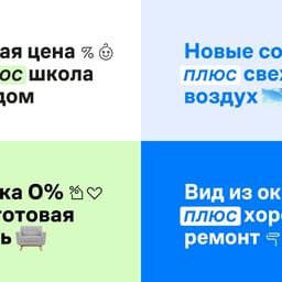
- Naming and Brand Identity for Samolet Plus
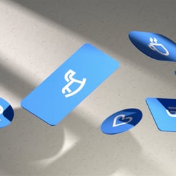
- The Clients created the name, brand identity, guidelines, and launch campaign for Samolet Plus, a real-estate service spanning home purchase, exchange, renovation, design, moving, and mortgages. The identity uses an italic “plus” tab, paired-desire copy lines, pastel accents, icons, and hyperbolic films to explain how the service connects multiple housing needs.
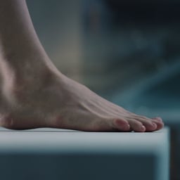
- Advertising for Samolet Mortgage
- The Clients created an advertising campaign for Samolet’s “Less Overpayment” mortgage, offering a 2.99% rate for the full term. Addressing the fear of committing to a mortgage, the film frames the decision as a diver’s intimidating leap: close shots build tension before the camera reveals that the diving platform is low, while the rate drops to 2.99% on the water.
- Advertising Film for Samolet Furnished Apartments
- The Clients created an advertising film for Samolet, which began selling apartments furnished with furniture and built-in appliances in spring 2021. Addressing the brief through the brand idea that Samolet gives people back time, the film imagines the days spent choosing and assembling furniture as missed moments living inside a wardrobe. A camera moves through the wardrobe into constructed scenes of fishing, photography and a lantern-lit dinner, before returning to a fully furnished room.

Border Zero (1)
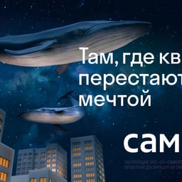
- Advertising Campaign for Samolet Real Estate
- Border:Zero created an image campaign for Samolet, a Moscow-based real estate developer. The concept encouraged viewers to move beyond dreaming of owning an apartment and instead focus on pursuing more meaningful aspirations, positioning home ownership as a step toward greater personal fulfillment.
ESH (1)
- Brand Identity Restyling for Samolet Developer
- ESH gruppa collaborated with Samolet and Pragmatika studio to reimagine the developer’s visual identity. Centered around the concept of home as a gravitational hub for life and emotion, the refreshed system introduces expressive typography and dynamic motion elements that convey warmth and movement.
Ony (1)
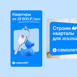
- Brand Identity and Design System for Samolet Real Estate Developer
- ONY developed a new brand identity and design system for Samolet, one of the largest real estate developers in the Moscow region. The updated style communicates openness, modernity, and technological innovation through geometric typography, modular layouts, and a refreshed digital blue color palette. The system includes a flexible visual language, custom pictograms, and comprehensive brand guidelines for consistent implementation.
See all cases
Sign in to your Pro account to see all 11 cases for Samolet. Full client collections require Pro.
Sign in