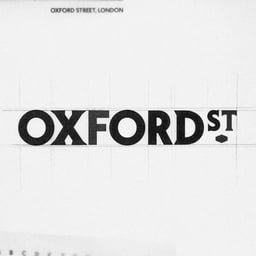
Oxford Street
Design work for Oxford Street, collected from the studios behind it.
- Design case
- 1
- Studio
- 1
- Latest work added
- Oct 2026
- Brand Identity 1
Design cases by studio
Koto (1)
- Brand Identity for Oxford Street
- Koto created a visual identity for Oxford Street for a new chapter shaped by pedestrianisation. The strategy, Oxford Street for everyone, treats the brand as part of the crowd and makes room for the street’s many different visitors and experiences. London Sans, a custom typeface inspired by London’s typographic heritage, is paired with a contrasting serif and a lozenge drawn from historic signage. Flowing typographic arrangements echo the movement of people, while an intersecting-letter monogram references local architecture and shop signs. Candid photography focuses on everyday encounters rather than idealised retail scenes. A flexible headline system brings humour to the campaign, and a family of icons draws on familiar sights and symbols to support wayfinding. Together, these elements provide a system designed to evolve with the street.