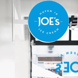
Joe's Ice Cream
Design work for Joe's Ice Cream, collected from the studios behind it.
- Design cases
- 2
- Studios
- 2
- Latest work added
- Oct 2026
- Brand Identity 1
- Packaging 1
Design cases by studio
designdough (1)
- Brand Refresh and Packaging for Joe’s Ice Cream
- Design Dough refreshed the brand identity and packaging for Joe’s Ice Cream to mark its 100 years of ice cream making. The work retained recognisable brand DNA while returning the palette towards the brand’s original blue and applying cleaner contemporary styling. Packaging for off-the-shelf products gave each flavour a distinct personality through unique colours, charming illustrations, and colour themes organised by flavour family.

Design Dough (1)
- Brand Refresh and Packaging Design for Joe's Ice Cream
- To celebrate its 100-year milestone, Joe’s Ice Cream sought a refreshed identity that honored its heritage while appealing to a new generation. The rebrand modernized the classic blue palette and introduced clean, contemporary styling with playful packaging that gave each flavor its own distinct personality.