Gaidelis
Design work for Gaidelis, collected from the studios behind it.
- Design case
- 1
- Studio
- 1
- Latest work added
- Nov 2026
- Brand Identity 1
Design cases by studio
Sons & Daughters ID (1)
- Brand Identity for Gaidelis Biscuits
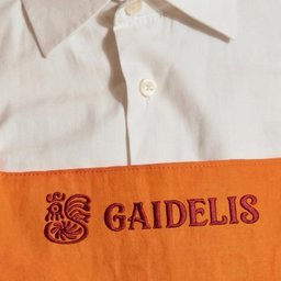
- Sons & Daughters ID rebuilt the identity of Gaidelis, the Lithuanian biscuit brand first baked in 1969. Decades of repeatedly tracing the rooster had left the communication logo different from the original symbol embossed on the biscuit. The studio returned to that product impression and redrew the rooster as a clearer monogram. An updated wordmark echoes the bird’s shapes, while a scalable family moves from the full signature to the rooster head and a compact G. A variable typeface provides different expressions for campaigns, and graphics inspired by stacks of biscuits connect the wider identity to the product. Icons and patterns extend the system across the brand’s many activities.