DeafCity Hub Design Cases
1 case across 1 studio
Designers behind the work
Designers and creative leads credited on DeafCity Hub projects in press coverage.
News & interviews
- TEMPLO Redesigns DeafCity Hub Identity
· Sep 24, 2026
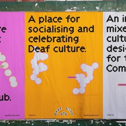
Brand New reviews a new identity for DeafCity Hub created by TEMPLO. The available article metadata identifies the project as a London culture and coworking-related rebrand featuring black, orange, pink, colorful elements, dot-matrix visuals, and motion.
- Templo creates DeafCity Hub identity with sign language and motion capture
It's Nice That · Sep 22, 2026
Templo created a dynamic visual identity and year-long pilot campaign for DeafCity Hub, a proposed mixed-use cultural space intended to empower and platform the Deaf community. The identity translates real British sign language gestures into motion-responsive visual assets through creative coding and motion-tracking software, using vivid pink and orange alongside a flexible fingertip-based logo.
- DeafCity Hub Logo Draws From Sign Language, Not Typeface
Creative Boom · Sep 16, 2026
Templo created DeafCity Hub's visual identity using motion-tracked hand movements inspired by British Sign Language rather than a conventional typeface. The resulting wobbly, bead-like lettering and hot-pink-and-bright-orange palette place deaf communication and culture at the centre of a new co-working and cultural space.