Burgez
Design work for Burgez, collected from the studios behind it.
- Design case
- 1
- Studio
- 1
- Latest work added
- Oct 2026
- Brand Identity 1
Design cases by studio
AUGE (1)
- Burgez
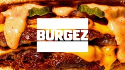
- AUGE Design’s Burgez identity and packaging project pairs a heavy uppercase wordmark with the contrasting serif line ‘Adultz taste’. The logo sits within a rectangular frame that carries across takeaway bags, wrappers, drinks cans, clothing and signage. Black, white and metallic gold establish the main visual contrast, with red bags and close-up burger photography introducing stronger colour. Compact blocks of copy appear as labels on the packaging, giving practical formats a dense typographic character. The application range includes gold burger wrapping, black and white paper bags, a white T-shirt and an illuminated sign. Across these different surfaces, the framed wordmark remains the most consistent element, while the mix of lettering styles gives the identity its visual tension.