Being your own client sounds like a designer's dream. Everyone understands the value of design. You can speak directly to the decision-makers. Then you remember that everyone in the room is a decision-maker, and everyone has an opinion about the logo.
That makes a studio rebrand unusually interesting. You get to see how the people who help other businesses explain themselves choose to be seen.
How&How has become HOW+HOW, introducing a new strategy, identity and website six years after Cat and Rog How founded the studio in 2020. Its London and Los Angeles teams have built the update around turn up your truth: identify the thing a brand can credibly own, then give it enough presence to be noticed.
“This was our chance to take our own advice,” Cat How says in the launch release. The interesting part is how that advice behaves once it becomes a logo, a sentence or an interaction.
A logo with a volume control
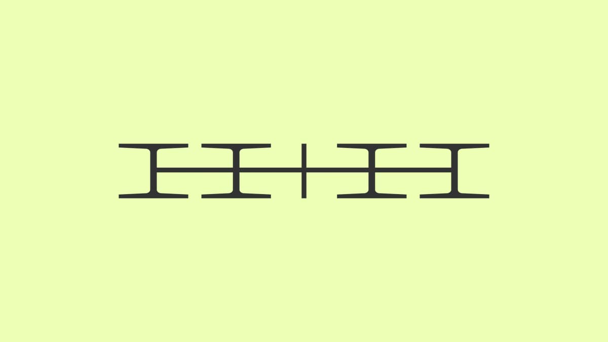
The new H+H mark takes its cue from an analogue volume dial. It stretches and contracts, with the horizontal strokes making the letters and plus sign feel connected. There is a pleasing tension between the fine serifs and the almost mechanical movement. It looks composed in a still image, then becomes much more playful in motion.
The updated green-yellow, nicknamed Gello, helps. It has enough brightness to register immediately, but the pale tone gives the black typography room to breathe. Wagram supplies the serif voice, while small interface labels bring a more technical rhythm to the website.
The illustrations add another personality: dark, grainy objects that twist into birds, loops, flags and stranger shapes. They have weight and texture. Set against the quiet backgrounds, they feel like little sculptures placed on a page.
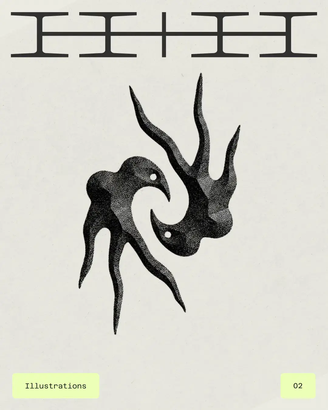
Some of those forms bring Further's identity to mind. The former DesignStudio also pairs elegant lettering with dark, sculptural 3D imagery; its pointed monogram shares some of the tension found in HOW+HOW's illustrations. To my eye, there is a family resemblance in the treatment of form and material. HOW+HOW's birds, loose loops and Gello accents make the overall mood lighter and more mischievous.
What I like here is the combination. The moving mark, illustration, colour and writing give one another something to work with. The personality emerges across the system.
The studio on both sides of the table
The management question is worth lingering on. Who writes the brief when the team already knows the business intimately? Who decides a direction is finished? How do you protect time for your own website while paying clients need theirs?
The launch material does not describe HOW+HOW's internal approval process, but its credits offer a useful detail: Edie Kueh and Jojo Jardim are credited for account management and operations, alongside the creative, strategy, design and development teams. Even a project about self-expression needs people responsible for moving it forward.
Further's Paul Stafford described the familiar difficulty in Design Week's account of that studio's rebrand: an agency is full of branding experts, each with a view. That is the peculiar challenge of this kind of work. Expertise is abundant; agreement still takes work.
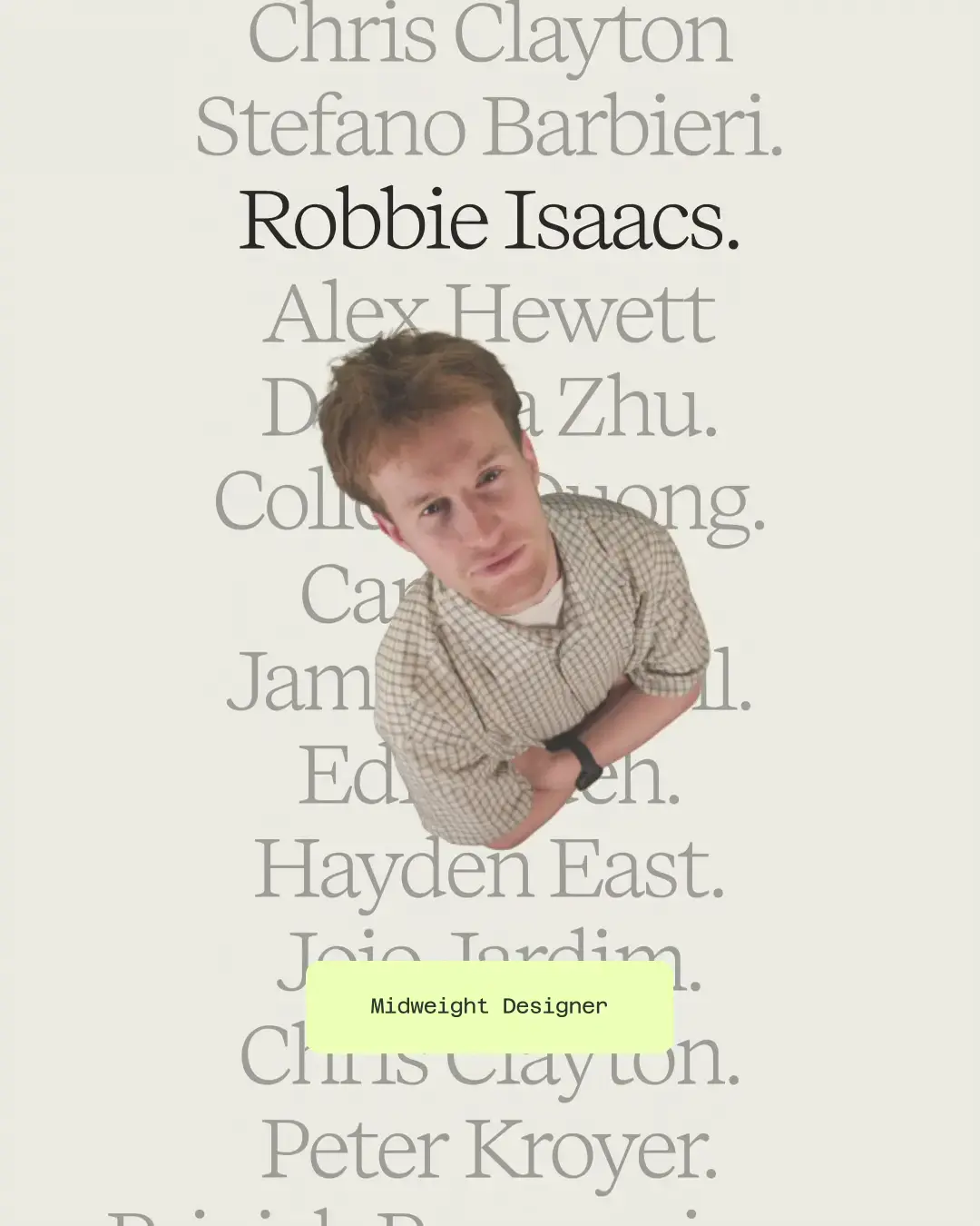
HOW+HOW gives itself a useful organising idea. A change can be judged against the promise of amplification: does it make the studio's character clearer? The flexible mark does that visibly. The shorter copy does it verbally. The team portraits bring the people behind the work into the experience.
The details people noticed
The early response on Cat How's launch post is warm, with several comments going beyond congratulations. Rob Alderson picked out the line “The truth is in there.” Copywriter Sam Newdigate praised the team-page hover interaction. Motion designer Leon Nikoo highlighted the colours, interactions and typography, while David Coveney singled out the logo.
Roger How's thread has the same celebratory mood. These are early launch-day comments from a professional network, including members of the studio, rather than a verdict from the whole industry. Still, it is encouraging that people are noticing the writing and small interactions as well as the main mark.
The identity you choose to become
“Turn up your truth” raises an interesting question: how much of a studio's identity is already there, waiting to be expressed, and how much takes shape through the act of expressing it? Choosing a voice, a visual language and a public promise helps a team decide who it wants to become.
That makes this rebrand a commitment. Once HOW+HOW presents itself this way, the identity sets expectations for the work it accepts, the people it hires and the standards it maintains. The playful surfaces carry a serious question: what will the studio need to do, day after day, to make this version of itself true?
HOW+HOW's accompanying essay, “Truth is cheap. Until it costs you something”, makes the strategy more concrete. It argues that choosing a position involves giving things up: audiences you cannot serve equally, claims a competitor can make better, parts of your story that need less space. That gives the volume metaphor some discipline. Someone still has to decide what gets turned down.
The new website also accounts for a changing audience. According to the studio, it is optimised for AI search, with dedicated pages for language models to read. The visual experience draws people in; the underlying information needs to explain the business clearly enough to travel beyond the page.
For me, the strongest thing about this rebrand is its sense of enjoyment. The typography has poise, the illustrations have oddness, and the interaction gives the team a presence. HOW+HOW has made its own advice tangible. Now it has a lively identity to keep living up to.
Credits
Creative direction: Chris Clayton, Priyjah Paramasivam, Cat How, Rog How. Strategy and verbal identity: Alex Roadnight, Will Nicklin, Hayden East. Design, motion and illustration: Callum Richards, Collette Duong, James Hansell, Robbie Isaacs, Stefano Barbieri, Danhua Zhu, Raaya Pathare, Rose Nicholls, Fraser Clarke, Laura Palmer, Eilidh Reid, Tor Ronals. Website design and development: Peter Kroyer. Account management and operations: Edie Kueh, Jojo Jardim.
Images and motion supplied by HOW+HOW. Illustration and team stills extracted from the supplied press films. Launch materials and LinkedIn comments reviewed on 28 October 2026.