Typeface Design for Agse
From a 1917 book cover to a headline typeface
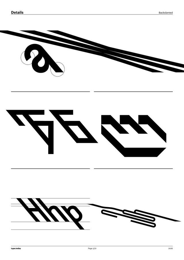
Agse draws on a Playfaces Telegram community exercise in which Vladimir Kolomeytsev shares a text sample and invites participants to create lettering from it. One sample — taken from a 1917 book cover — served as the historical prototype. Designer Elena Novoselova combined that source with contemporary calligraphy and Art Nouveau typographic plasticity to create a narrow old-style serif distinguished by sharply slanted ovals that alternate direction and grasping vertical serifs. It is a headline typeface that pairs well with a quieter serif or sans-serif text face and suits experimental treatments such as shadows or outlines.
Set in Agse
Insights
- The design originates from a Playfaces Telegram community exercise where Vladimir Kolomeytsev shares a text sample and invites participants to create lettering.
- A 1917 book cover served as the direct historical prototype for the letterform character.
- Novoselova combined that historical reference with modern calligraphic construction and Art Nouveau formal qualities.
- The typeface works well paired with a quieter serif or sans-serif text face and is suited to shadowed or bordered display use.
1 / 4Swipe
Keep exploring
Related cases


