Packaging redesign for a premium juice brand
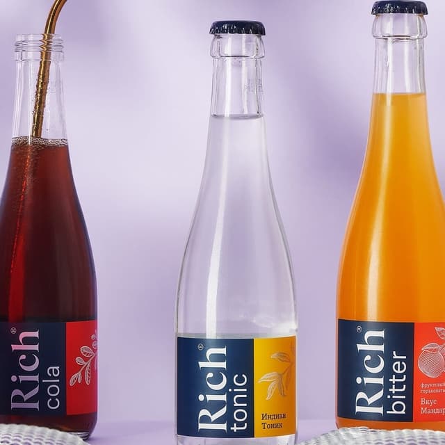
Tuman Studio led a packaging redesign for Rich, a premium line of 100% juices and nectars crafted by Multon, part of Coca-Cola HBC. The project delivered the brand’s first major refresh in two decades, presenting the premium range in a new way while preserving its iconic restraint. Inspired by 19th-century botanical paintings, the system features custom fruit illustrations that invite close study of nature and signal product quality. Minimal layouts, precise composition, and meticulous details uphold the brand’s laconic character, balancing elegance with shelf clarity. Typography by Contrast Foundry—CoFo Sans and CoFo Robert—anchors the design with refined legibility across formats, creating a distinctive packaging series that elevates perception without losing continuity.
Keep exploring
Related cases