Tare
Light, shadow and transparency turn financial visibility into Tare’s recurring visual language.
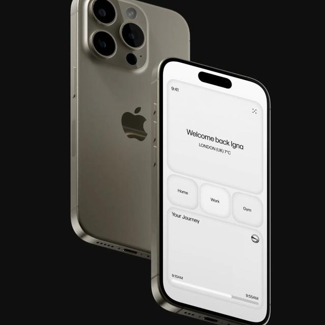
Studio NARI created an identity for Tare around making the hidden structures of finance more visible. Light, shadow, translucent surfaces and changing opacity become a recurring visual language across imagery, editorial content and digital interfaces. The system addresses borrowers, distributors and lenders through a shared idea of revealing information at the depth each audience needs.
Insights
- Backlit photography and translucent surfaces translate the hidden-to-visible idea into imagery. The same relationship appears in graphic layers and interface treatments, connecting the concept across media.
- The system is designed to reveal information at different depths. A brief brand message can introduce one idea, while product and editorial contexts allow more detail to emerge without changing the visual identity.
- Everyday people and generous editorial space temper the technical subject matter. Data and explanation are integrated into the visual system rather than separated from the brand’s more expressive imagery.
1 / 15Swipe
Keep exploring
Related cases