Rebrand For A Non-invasive Aesthetic Clinic
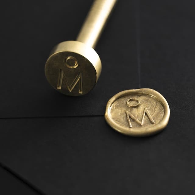
M — N Associates rebranded Ruco Clinic, a pioneer in non-invasive dermatology, cosmetic procedures, and skincare with a spa-like atmosphere for women. The studio developed “The Femina,” an infinite looping device evolved from the previous logo to express softness, femininity, flawlessness, and attentive care. This core idea shaped a broader brand system, including four graphic motifs representing perfection, flexibility, sustainability, and femininity across print and digital touchpoints. M — N Associates also built an iconography system from the logotype, paired it with Helvetica Neue, and created layouts that emphasized clarity and immediacy. The rebrand extended into custom-fitted staff uniforms with subtle branded details, helping Ruco Clinic present a polished, elegant, and consistent image.
1 / 9Swipe
Keep exploring
Related cases


