Palais de Tokyo
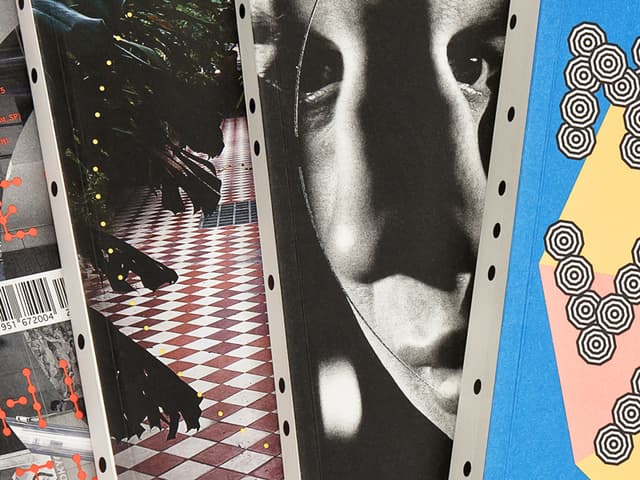
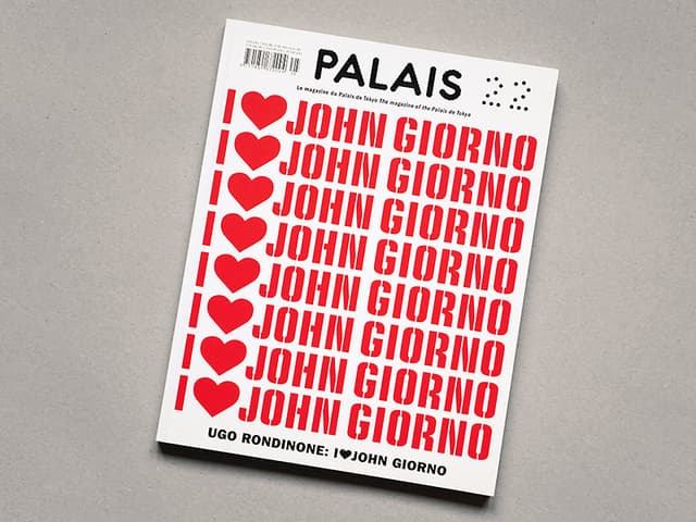
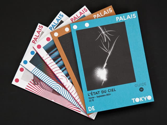
Logo and type design for the new 2012 Palais de Tokyo visual identity. Creation of the dot font family Palais , consisting in 4 weights playing on dots density and size. From these 4 primary weights, we design a lot of variations to make the visual identity alive, especially for the quarterly magazine Palais .
1 / 8Swipe
Keep exploring
Related cases