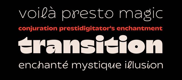
Typeface Design for Fontfabric
Geometry anchored by humanist warmth
Intro is a geometric sans-serif family designed by Svetoslav Simov at Fontfabric, inspired by early 20th-century geometric typefaces—Futura, DIN, and Avant Garde among them. Its construction is built on triangular, circular, and square forms, tempered by humanist details that are especially visible in the italic cuts. The family spans 72 styles across standard, condensed, and inline widths, with weights from Thin to Black plus obliques.
Set in Intro
Insights
- Simov cited DIN, Futura, and Avant Garde as named inspirations, grounding the design in a specific early-20th-century geometric tradition.
- Humanist details are especially visible in the italic cuts, according to the design description.
- The family includes inline variants alongside italics and obliques, enabling layered typographic treatments within a single family.
- Credits list Svet Simov as type director, art director, and co-designer; Stan Partalev as co-designer and font producer; Plamen Motev as font producer; and Vladislav Yordanov on presentation design.
1 / 3Swipe
Keep exploring
Related cases


