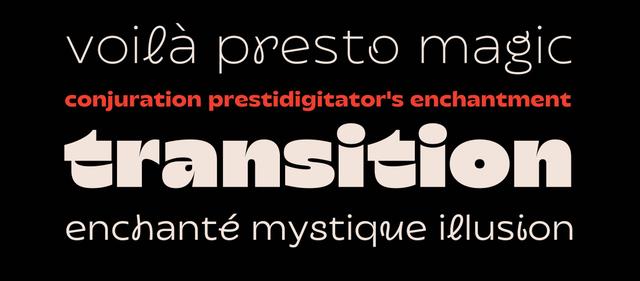
Type Design for Postamp Grotesk
A postage stamp sparked a type family
Postamp Grotesk is a condensed geometric sans serif family by Fontfabric, drawing on late 19th- and early 20th-century American typography—specifically lettering on historic U.S. postage stamps, with a James Buchanan stamp as the initial reference. Its defining structural feature is a width-variation system where select letterforms (B, C, D, G, M, O, P, R) carry expanded proportions against an otherwise condensed base. The family comprises 10 static styles plus a variable font with weight and width axes, covering Extended Latin and Cyrillic.
Set in Postamp Grotesk
Insights
- Design origin traces to a U.S. stamp featuring President James Buchanan, which prompted broader research into stamp typography and early American type specimens.
- The 'Mix' styles isolate the width-variation concept into discrete static cuts; the variable font's width axis spans from fully condensed to selectively wide on chosen characters only.
- Five weights each paired with a 'Mix' counterpart yield ten static styles, with no separate wide or expanded subfamily.
- Credits distinguish type direction, type design, font production, art direction, and presentation design across separate named contributors.
1 / 4Swipe
Keep exploring
Related cases


