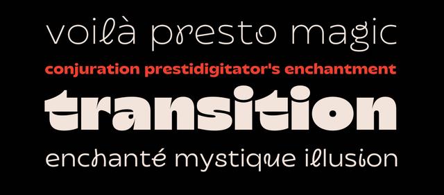
Typeface Design for Fontfabric's Nexa Font Family
Circle as foundation: geometric purity scaled to 36 styles
Nexa is a geometric sans-serif typeface developed by Fontfabric, with type direction and design led by Svet Simov and Plamen Motev alongside a broader team. Its construction is fundamentally rooted in circular geometry, producing clean-cut forms with optimized kerning. The family spans 36 styles across 9 weights, divided between a main subfamily and a dedicated Nexa Text subfamily optimized for extended reading through more generous spacing and enlarged internal white spaces. It supports over 130 languages across Extended Latin and Cyrillic scripts.
Set in Nexa
Insights
- A separate Nexa Text subfamily was developed specifically for longer reading, with more generous spacing and enlarged internal white spaces distinguishing it from the main subfamily.
- Stylistic Set 02 (SS02) offers squared-stroke alternates intended for display use, providing a distinct optical variant within the same family.
- The OpenType feature set includes localized Cyrillic variants for Azeri, Kazakh, Turkish, Tatar, Crimean Tatar, and Bulgarian, reflecting deliberate multilingual engineering beyond basic script coverage.
- The family includes tabular figures, extra ligatures, various fractions, and small caps, indicating structured attention to editorial and data-heavy typesetting scenarios.
1 / 4Swipe
Keep exploring
Related cases


