Tomorrow
Design work for Tomorrow, collected from the studios behind it.
- Design cases
- 10
- Studio
- 1
- Latest work added
- Nov 2026
- Typography 10
Design cases by studio
A preview of 6 cases across 1 studio. The full collection is included with Pro.
type.today (10)
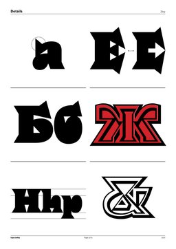
- Typeface Design for Zloy
- Zloy is a heavy serif designed by Daria Petrova, notable for its counter-less lowercase letterforms. It is not suited to small sizes but works well with experimental treatments such as shadowing, outlining, and decoration. The family includes two styles: Roman, which produces a dense, complicated texture at tight settings, and Vey, which adds intricate inner borders to the letterforms.
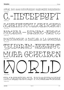
- Typeface Design for Tomasa
- Tomasa is a typeface by Fer Cozzi rooted in urban sounds and visuals. Each glyph is individually explored as an interpretation of city-landscape artifacts, evoking the peculiarities of graffiti and tags. The family provides four structural variants per letter, representing the diversity, dynamics, and rhythms of hip-hop. Its name is a tribute to Chilean singer Tomasa del Real and the neoperreo dance movement.
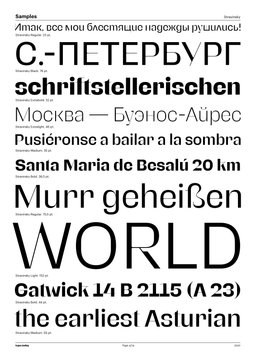
- Typeface Design for Stravinsky
- Stravinsky is a display typeface by Ilya Naumoff that fuses 18th-century Didot-style vertical contrast and squarish counters with contemporary sans-serif Grotesk structure. The design is deliberately experimental, described as relying on a hidden underlying order. Its character shifts depending on pairing, reading as either classical or strikingly contemporary.
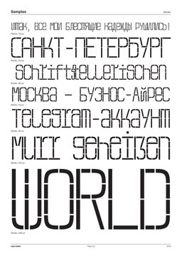
- Typeface Design for Retiler
- Retiler is a modular typeface by Rodion Ilyukhin built on a strict grid: each glyph's m box divides into three macro modules, each containing 24 micro modules arranged across a six-column grid. Lowercase and uppercase letters share the same height; diacritics push the letter into the m box, keeping everything within bounds for tight-leading headline use. A stylistic set takes accent marks out of the m box, making the face usable for small-text settings. The modular structure also supports vector graphic construction by disassembling individual glyphs into component modules.
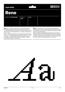
- Display Typeface Design for Rene
- Rene is a display serif by Fedya Abroskin built on a grid of rounded rectangles, combining flat serifs with exaggerated ink traps. It follows pointed-nib logic, producing wide vertical strokes and narrow horizontal ones. A near-classical skeleton coexists with bit-mapped texture, while static upright lowercase characters contrast with unconventional italic uppercase forms.
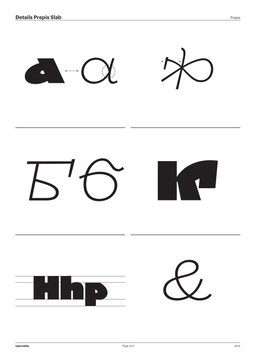
- Typeface Design for Medieval Cyrillic Scripts
- Prepis is Luboslav Boyanov's graduation typeface from the TypeMedia programme at the Royal Academy of Art, The Hague. It draws on medieval Cyrillic writing traditions — specifically Ustav and Skoropis — which, like Blackletter, have been appropriated by nationalist and far-right groups. The design responds with playful, contemporary forms intended to detach these scripts from those associations and return them to broader cultural use.
See all cases
Sign in to your Pro account to see all 10 cases for Tomorrow. Full client collections require Pro.
Sign in