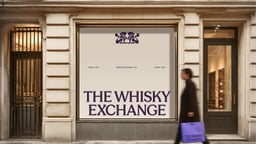
The Whisky Exchange
Design work for The Whisky Exchange, collected from the studios behind it.
- Design case
- 1
- Studio
- 1
- Latest work added
- Nov 2026
- Brand Identity 1
Design cases by studio
Otherway (1)
- The Whisky Exchange
- Otherway refreshed The Whisky Exchange’s identity around the pleasure of discovering fine spirits, balancing specialist expertise with an accessible tone. The studio reworked the original crest, retaining its lions while giving the emblem a lighter, more fluid expression. A vibrant purple anchors the visual system, providing a distinctive backdrop for the brand’s products and messages. Label-inspired stamps, graphic shapes and layered compositions draw on the tactile world of printed drinks labels. These elements extend across retail applications, including shopping bags and storefront graphics, as well as digital design. The project covers strategy, identity, voice, design and digital work. By bringing the historic crest together with contemporary colour and flexible graphic elements, the identity creates a shared visual language for both expert knowledge and the invitation to explore.