Sternberg Press
Design work for Sternberg Press, collected from the studios behind it.
- Design cases
- 9
- Studios
- 2
- Latest work added
- Jun 2025
- Print Design 5
- Editorial 4
Design cases by studio
A preview of 6 cases across 2 studios. The full collection is included with Pro.
A Practice for Everyday Life (8)
- Book Design for Art and (Bare) Life: a Biopolitical Inquiry
- A Practice for Everyday Life designed the publication 'Art and (Bare) Life: A Biopolitical Inquiry' by Josephine Berry for Sternberg Press. The design subtly mirrors the book’s exploration of political philosophy and contemporary art through bold typographic contrasts and striking color choices. A bespoke typeface and vivid palette evoke tension between modernity and history, reflecting the text’s conceptual depth.

- Book Design for Botanical Drift: Protagonists of the Invasive Herbarium
- A Practice for Everyday Life designed the book *Botanical Drift*, published following a workshop at Kew Gardens. The design draws inspiration from botanical specimen labels and field guides, featuring bespoke lettering, fern-like ornamentation, and a recycled board cover. Inside, a dynamic grid and animated running headings echo the spirit of botanical exploration and the layout of the Marianne North Gallery.

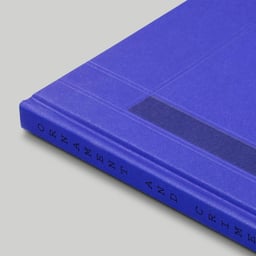
- Editorial Design for Ornament and Crime Exhibition Publication
- A Practice for Everyday Life designed the publication 'Ornament and Crime' to accompany a group exhibition curated by Meg O’Rourke at Eykyn Maclean in New York. The design draws inspiration from Modernist principles and Piet Mondrian’s Tableau-poème, featuring linear motifs and asymmetrical layouts that echo the exhibition’s conceptual framework.
HelloMe (1)
- Book Design for Miamification by Sternberg Press
- HelloMe® developed the book design for 'Miamification', published by Sternberg Press. The project explores the visual identity of the publication through a contemporary and conceptual layout that reflects the book’s critical and cultural themes.
See all cases
Sign in to your Pro account to see all 9 cases for Sternberg Press. Full client collections require Pro.
Sign in