San Siro Stadium
Design work for San Siro Stadium, collected from the studios behind it.
- Design case
- 1
- Studio
- 1
- Latest work added
- Nov 2026
- Typography 1
Design cases by studio
TypeTogether (1)
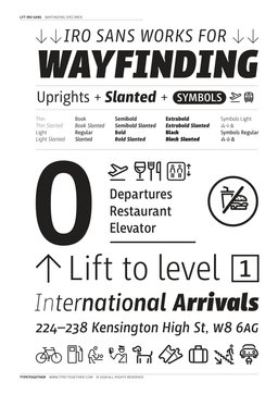
- Typography for San Siro Stadium Wayfinding
- Milan-based Leftloft studio originated LFT Iro Sans from a wayfinding commission for San Siro stadium, where legibility under poor lighting and irregular wall geometry was the primary constraint. The project expanded to address a recurring problem in public-space signage: mismatched typefaces and icon families undermining brand coherence. The solution unified a text face, a unicase display style, and a custom pictogram set into a 38-member family. Pictogram shapes were radically simplified so meaning and visual language align with the letterforms.