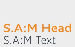
S.A:M®
Design work for S.A:M®, collected from the studios behind it.
- Design case
- 1
- Studio
- 1
- Latest work added
- Nov 2026
- Typography 1
Design cases by studio
TypeMates (1)
- Custom Typeface for S.A:M®
- TypeMates designed a bespoke two-style typeface for S.A:M®, the B2B brand of catering system engineer Thomas Mertens, active in the point-of-sale snack sector. The project began before any corporate design existed, requiring TypeMates to derive type attributes directly from brand values: smart, modular, high-quality, and future-oriented. The family pairs a Bold spacious display style with a Light narrow text style, designed to work together across all sizes. Both styles were screen-optimised and include icons, fractions, superscript figures, tabular figures, and broad European language support.