Runestone
Design work for Runestone, collected from the studios behind it.
- Design case
- 1
- Studio
- 1
- Latest work added
- Nov 2026
- Brand Identity 1
Design cases by studio
Less–AndBetter (1)
- Brand Identity for an Esports Data Platform
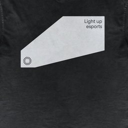
- L–AB developed Runestone’s brand around the idea Light up esports, making a real-time data and fan-engagement infrastructure business visible through a language of directed light. The Radiant Stone mark combines radiating segments with a rounded square in negative space, translating the idea of an inscribed stone into a symbol that broadcasts information. Black and white form the default palette; yellow is reserved for the beam and important information. Studio Feixen Edgy provides the typography, with four stylistic sets fixed to create a consistent balance of angular character and clarity. A square grid structures the system, while photography places viewers close to players and equipment in arena light. The beam extends across event displays, social content, stationery, badges and apparel, pointing attention towards selected information.