Lobo Vasques Studio
Design work for Lobo Vasques Studio, collected from the studios behind it.
- Design case
- 1
- Studio
- 1
- Latest work added
- Oct 2026
- Brand Identity 1
Design cases by studio
Another Collective (1)
- Brand Identity for Lobo Vasques Studio
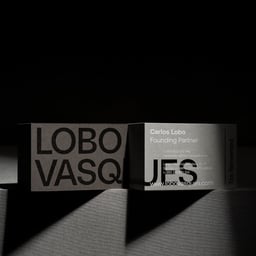
- Another Collective’s identity for Lobo Vasques centres on a large uppercase wordmark and a restrained black, white and grey palette. Across the printed applications, the name shifts between a single horizontal line and tightly cropped arrangements that break the lettering across surfaces. Small information blocks and fine rules contrast with the scale of the name. The system appears on business cards, stationery, printed covers and website presentations for desktop and mobile. Product photographs place the printed pieces on simple geometric supports, using strong directional light and deep shadows to emphasise their edges and surfaces. The result is a typography-led presentation in which cropping, scale and arrangement provide variation within a consistent monochrome vocabulary.