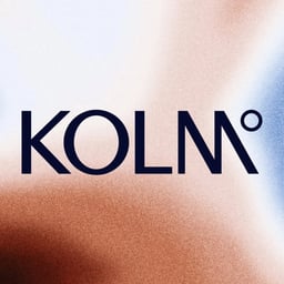
Kolm Kontrast
Design work for Kolm Kontrast, collected from the studios behind it.
- Design case
- 1
- Studio
- 1
- Latest work added
- Oct 2026
- Brand Identity 1
Design cases by studio
Bruce Mau Design (1)
- Brand Identity for Kolm Kontrast
- Bruce Mau Design created the brand identity for Kolm Kontrast, a Vancouver hot-cold contrast therapy studio. The identity includes a wordmark with custom letterforms, including an “M” informed by Vancouver’s Twin Sisters mountains and thick-thin line contrasts referencing the therapy process. Specialized thermal-camera imagery records the effects of heat and cold on bodies, objects, and environments, while an earth-toned temperature palette departs from conventional red-and-blue thermal cues.