ITALICS
Design work for ITALICS, collected from the studios behind it.
- Design cases
- 3
- Studio
- 1
- Latest work added
- Sep 2026
- Brand Identity 3
Design cases by studio
Giga Design (3)
- Visual Identity for ITALICS' Panorama Exhibition
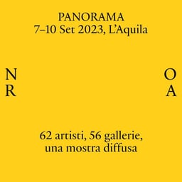
- Giga created a flexible visual identity for Panorama, ITALICS’ recurring annual art exhibition staged across changing Italian territories. The system uses outward-facing inverted parentheses, an animated logotype, and territory-derived colour to frame artworks and landscapes while adapting to each edition.

- Visual Identity for Panorama Monferrato Exhibition
- Giga developed the visual identity for Panorama Monferrato, the fourth edition of ITALICS’ traveling art exhibition. The design expanded on the parenthesis symbol central to Panorama’s identity, creating a graphic language of glyphs that represent a journey connecting the host towns. A photo campaign by Louis De Belle complemented the concept with playful imagery of a flag across the rural landscape.
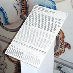
- Visual Identity for Panorama L'Aquila Art Exhibition
- Giga Design Studio created the visual identity for Panorama L’Aquila, the third edition of ITALICS’ traveling art exhibition. The design uses dynamic typography and color blocks to reflect the city’s landscape and guide visitors through its historic spaces, complemented by new photographic imagery by Louis De Belle.