Immowelt
Design work for Immowelt, collected from the studios behind it.
- Design case
- 1
- Studio
- 1
- Latest work added
- Nov 2026
- Typography 1
Design cases by studio
TypeMates (1)
- Custom Typeface for Immowelt
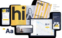
- TypeMates designed immo Sans as a custom UI typeface for immowelt, a German-language real estate portal, as part of a broad brand and interface redesign launched in 2020. The family resolves a previous inconsistency between a geometric print typeface and a humanist sans used on screen, unifying both roles in one realist sans with American Gothic references. Seven weights from Hairline to Black serve everything from small-screen body text to display headlines. A serifed lowercase 'l', introduced for legibility, became a defining brand characteristic.