Grupo Trevo
Design work for Grupo Trevo, collected from the studios behind it.
- Design case
- 1
- Studio
- 1
- Latest work added
- Nov 2026
- Brand Identity 1
Design cases by studio
Studio Cama (1)
- Brand Identity for Grupo Trevo Fuel Company
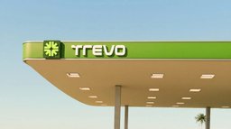
- Studio cama created a rebrand for Grupo Trevo, a Brazilian fuel company operating fuel distribution, gas stations, and tanker trucks. The identity retains the brand’s clover and green color equity, reinterpreting the four-leaf clover as four arrows converging at a center, with negative space forming a crossroads. The wordmark uses a customized version of Evolver, pairing angular and rounded corners with the symbol’s construction. Dark and bright greens form the primary palette, with blue and yellow used sparingly as secondary colors.