Coca-Cola HBC
Design work for Coca-Cola HBC, collected from the studios behind it.
- Design cases
- 2
- Studio
- 1
- Latest work added
- Feb 2026
- Packaging 2
Design cases by studio
Tuman (2)
- Packaging design for Coca-Cola HBC's natural carbonated juice line
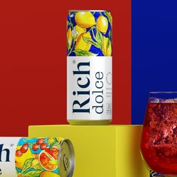
- Tuman developed packaging for Rich Dolce (Rich Bubbles), a new line of natural carbonated juice drinks from the Rich brand. Inspired by Southern Italy, the design balances a laconic layout with a vivid, expressive character. A large masterbrand wordmark maximizes shelf recognition, while a circular emblem clearly marks the Bubbles subline. Typography references 19th-century Clarendon to blend heritage cues with contemporary clarity. High-contrast color pairings—yellow with blue and red with blue—boost visibility and flavor navigation. Bright, artistic illustrations evoke Tuscan majolica to convey fruit richness and a distinctly Italian spirit. The range launches in two variants—sweet cherry with tart grapefruit, and refreshing lemon—highlighting up to 70% fruit and berry juice, water, bubbles, and no added sugar. The system communicates quality, flavor intensity, and provenance, giving the sparkling juice line a distinctive presence.
- Packaging design for Coca-Cola HBC’s sparkling juice line
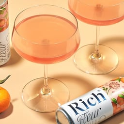
- Rich Fleur is a line of natural sparkling, juice-based beverages inspired by the traditions of Provence. Made from ripe fruit and berry juices with floral and herbal extracts, the range includes rose-mandarin and grape-lavender flavors. The assignment was to create packaging that communicates simplicity, freshness, and a distinctly Provençal character. The solution pairs a soft, sun-washed color palette with custom botanical illustrations and bespoke logotype lettering that reinterprets 16th-century French cursive, emphasizing the drink’s aromatic qualities. Photography and layout choices reinforce lightness and effervescence while unifying the SKUs. The result is a refined shelf presence that distinguishes the line within the nonalcoholic category and aligns with Coca-Cola HBC’s premium positioning.