Casa Rojo
Design work for Casa Rojo, collected from the studios behind it.
- Design cases
- 5
- Studio
- 1
- Latest work added
- Mar 2024
- Packaging 5
Design cases by studio
MABA (5)
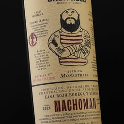
- Packaging for Machoman Wine
- Estudio Maba refreshed the packaging for Machoman, a Casa Rojo wine marking ten years since its first vintage. The label uses a dense mix of typographic voices, while the shipping box extends the product’s character into the unboxing experience.
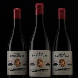
- Packaging for Viñas Bastardas Wine
- Casa Rojo created Viñas Bastardas, a wine blending two territories, grape varieties, and family wineries. The packaging uses split heraldry and crossed-out label text to make the product's restricted provenance information visible through censorship.
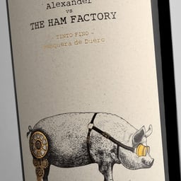
- Wine Label Design for Casa Rojo
- Packaging for Alexander vs The Ham Factory, a wine from Pesquera del Duero created for Casa Rojo. The label is intended to combine the wine’s roots with the spontaneous personality of Wine Gurus’ members.
- Label Design for Musso Organic Wines
- Maba designed labels for MUSSO, Casa Rojo’s collection of organic wines. Realistic, finely detailed illustrations of native animals pair each red, rosé, and white wine with the nature surrounding its growing area.
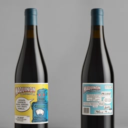
- Packaging for Maquinon Wine
- Casa Rojo refreshed Maquinon, a Garnatxa wine from the D.O.Q. Priorat, through bright, colour-led packaging built around its existing smoking-robot identity. The front and back labels create a connected narrative, while the shipping box also functions as an in-store display.