Armatore
Design work for Armatore, collected from the studios behind it.
- Design cases
- 3
- Studio
- 1
- Latest work added
- Oct 2026
- Brand Identity 2
- Packaging 1
Design cases by studio
Lettera7 (3)
- Packaging Design for Armatore Seafood Collections
- Lettera7’s evolving work for Armatore explores maritime culture through a series of food packaging collections. The studio describes a nine-year relationship in which each new range introduces a different expressive language while remaining connected to the sea. Illustration, typography, colour and composition distinguish individual products across a growing brand world. The case brings together packaging for fish products, sauces, spreadable creams, savoury chips and Pan del Mar, alongside environmental applications including mural design. Product photographs and captions show the language moving between jars, tubes, bottles, bags and boxed presentations, as well as a temporary store. Lettera7 reports three Pentawards in 2026: gold for Linea Core in Fish, Meat and Poultry, silver for Pan del Mar in Gourmet Foods, and bronze for Chips in Savoury Snacks.

- Armatore Lo zingaro di mare
- Lettera7 created the naming, brand identity, packaging, illustration, and digital presence for Armatore, a family seafood business. The identity draws on four generations of Mediterranean fishing, framing the brand around the “sea gypsy” who travels, explores, and fishes among the waves.

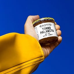
- Brand Identity and Packaging for 4 Rotte
- Lettera7 developed the brand identity and packaging for 4 Rotte, a new product line from Armatore. The design reflects the brand’s expansion into broader culinary horizons while maintaining its maritime heritage and refined aesthetic.