ARTE Design Cases
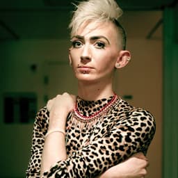
Designers behind the work
Designers and creative leads credited on ARTE projects in press coverage.
Designers and creative leads credited on ARTE projects in press coverage.
Steven Heller interviews comic artist Michael DeForge about his new book 'All the Cameras in My Room,' published by Drawn & Quarterly. DeForge discusses his approach to satire, emotional storytelling, and the use of multiple visual styles to explore themes of technology, grief, and identity. The conversation highlights his influences and creative process behind several stories in the collection.
It’s Nice That announces the April 2026 edition of Nicer Tuesdays, taking place at EartH Hackney in London. The event will feature talks by Marina Willer, Lizzy Stewart, Intra, and Ollie Babajide Tikare, covering topics from human insight in design and illustrated novels to digital art and photographic storytelling. The evening celebrates experimentation, creativity, and cross-disciplinary practice in contemporary design and art.
The article profiles illustrator Tom Gauld and his new book 'Physics for Cats', a collection of science-themed cartoons originally created for New Scientist. Blending humor and research, Gauld turns complex scientific ideas into witty, accessible illustrations featuring cats and scientists. The piece highlights his creative process, inspirations, and the book’s publication by Canongate and Drawn & Quarterly.
The article, written by Ellis Tree for It’s Nice That’s Forward Thinking series, explores five emerging graphic design trends for 2026. It highlights a growing return to analogue and imperfect aesthetics, such as photocopied textures, scanning, and collage, as designers push back against hyper-digital polish. Examples include Charlotte Rohde’s Oficía Mono campaign, How&How’s branding for Big Cartel, and Louis Garella’s logo for Sonata Electronica.
DNCO has created a new identity for Amsterdam’s Zuidas district, rebranding it as ‘Zudo’ to reflect its transformation from a corporate hub into a livable, community-focused neighbourhood. The project features a bilingual tone of voice, a custom stencil typeface by Bold Decisions, and warm illustrations by Luis Mendo to convey a sense of local charm and inclusivity.
The article profiles designer Ben Wood and his ongoing project 'Untitled Unfinished', a poster series that revives rejected or incomplete works. It explores his playful approach to typography and colour, his collaboration with creative director Vasso Vu on Ashnikko’s album campaign, and his broader work across music and cultural clients. The piece highlights his curiosity-driven process and experimental spirit.
The article explores the collaboration between design studio PORTO ROCHA and the Museu de Arte de São Paulo (MASP) on the museum’s rebrand, facilitated by Frontify. It highlights how shared cultural understanding, trust, and open dialogue guided the sensitive modernization of a national institution’s identity. The project retained MASP’s iconic red while introducing a refined logo, new symbol, and flexible visual system aligned with the museum’s expansion.
BP&O features Marx Design’s branding and packaging for Cashflow Vodka, a new product from Departed Spirits. The identity embraces financial struggle as a creative concept, using brutalist typography, lo-fi aesthetics, and a terminal green palette to convey honesty and humor. The project subverts typical vodka branding with brown bottles and a self-aware tone that critiques industry pretence.


