This week's cases share something worth noting: none of them are loud. A retail space in Shenzhen that embeds brand narrative into its fixtures. A design system for a tech company that somehow feels organic. An eyewear shop in Melbourne that treats its interior as a stage set. Two fashion brands from Toronto that know exactly how much to say and when to stop. Each project earns attention through restraint — through knowing what to leave out.
Here are five projects from the past week.
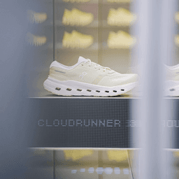
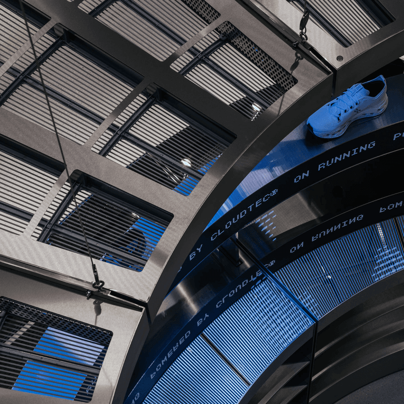
On's Movement Lab Gets Permanent Fixtures in Shenzhen
On is a running brand that behaves like a design company. That's not an accident — they've spent years building a product language around movement and materiality. So when Amsterdam-based Modem partnered with On's internal architecture team to design a series of permanent retail fixtures for the Movement Lab in Shenzhen, the brief wasn't "make a nice shop." It was: build something structural.
The space integrates digital storytelling directly into the physical environment. Content layers sit inside the architecture, not on screens bolted to walls. Localized content is supported by a bespoke Chinese typographic system designed by Tom Schwaiger and Wei Huang — language treated as a spatial material, not an afterthought.
The best retail environments don't display the brand. They are the brand.
What makes this case interesting is the permanence. Most brand activations in retail are temporary — pop-ups, seasonal builds, campaign windows. These are permanent fixtures. The commitment signals something: On sees physical retail not as a distribution channel but as a narrative space. The Movement Lab isn't a store with a brand experience attached. It's a brand experience that happens to sell running shoes.
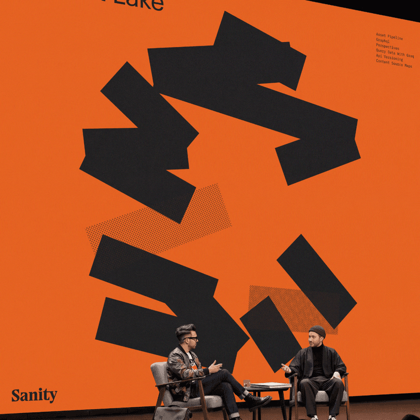
Bleed Builds a Design System for Sanity
Sanity calls itself "The Content Operating System." That's a strategic choice — it positions the product not as a CMS competing with WordPress and Contentful, but as infrastructure. An operating system is something you build on, not something you replace every two years. Oslo-based Bleed needed to build a visual identity that could hold that claim.
The tension at the center of the project is real: Sanity serves over a million users across 6,000+ teams, and its audience splits cleanly between developers (who want precision, documentation, reliability) and marketers (who want expressiveness, flexibility, warmth). Most identities pick a lane. Bleed tried to hold both.
The result is a system built on deliberate contrast — organic, expressive elements paired with precise technical structure. It's not a logo slapped onto a color palette. It's a comprehensive design system that flexes across digital and physical applications while staying coherent. The award from Gullblyanten — Norway's top creative prize — suggests it landed.
The real test is scale. Sanity is growing fast. The identity has to work not just for today's product but for a platform that will look different in two years. Bleed built for that, and it shows.
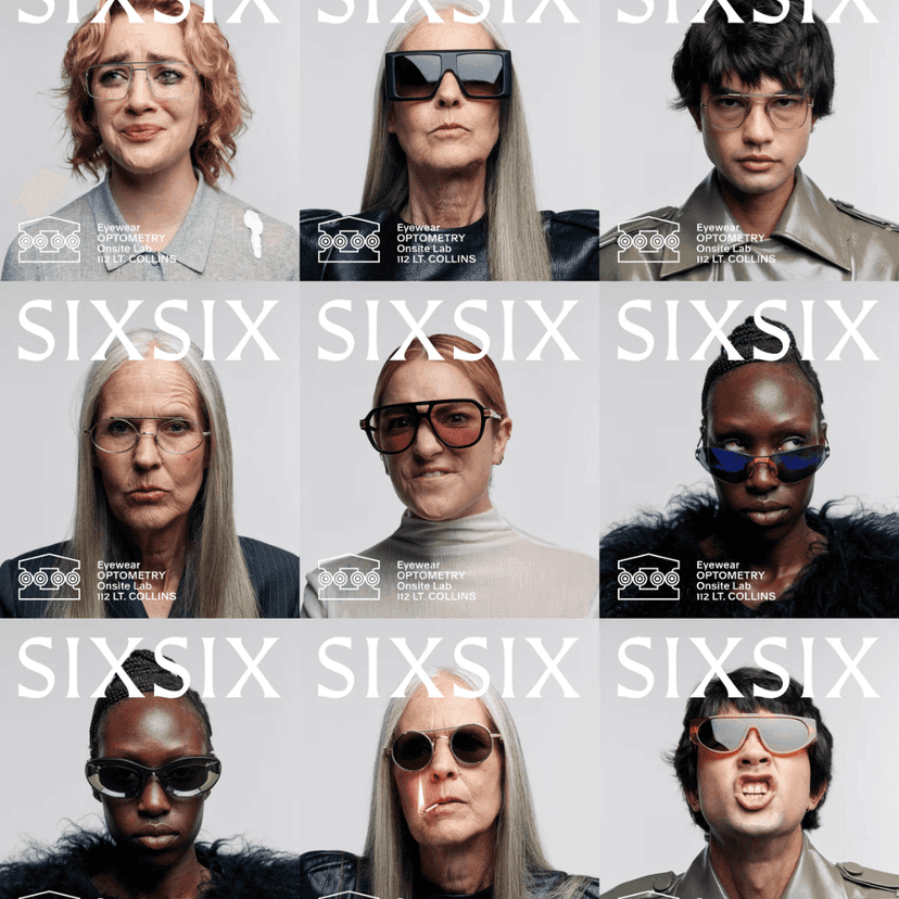
A Friend Of Mine Turns an Eyewear Shop Into a Temple
Six Six opened on Little Collins Street in Melbourne in January 2026. It's a multi-brand eyewear retailer and optometrist founded by Emma Buckley — fifteen years shaping luxury eyewear across APAC — and Dr Natalie Boffa, a decade-long independent Melbourne optometrist. The shop has an on-site optical lab that can deliver same-day lenses. The founders know their craft. They needed an identity that matched.
London-based A Friend Of Mine built the brand around the idea of a temple. Not metaphorically vague — architecturally specific. The brandmark uses four circles with radial inset rings that reference the tops of Ionic columns, framing "vision held within the temple's bounds." The logotype is detailed to feel carved from stone.
The color palette was co-developed with interior architects Kennedy Nolan. The core warm yellow was chosen to complement skin tones — so people trying on frames look good in the mirror. That's the kind of detail that separates brand-as-decoration from brand-as-experience.
When your color palette is chosen to flatter the customer's reflection, the brand is working at the level of the body, not just the eye.
Then there's the campaign work: character-driven film vignettes with humorous beats, the temple marque boldly overprinted across models' faces to obscure their eyes, custom soundtracks and subtitles "built to stop a scroll." In-store, films play on an oversized screen upholstered in fluffy white fur — part sculpture, part display. Short animated idents weave the marque, typography, and logomark into playful mini ad breaks. The whole thing is theatrical, specific, and deeply considered.
Newkid Gives Two Toronto Fashion Brands a Quiet Identity
The next two projects come from the same studio: newkid, based in Toronto. Both are fashion identities. Both are restrained. But they solve very different problems.
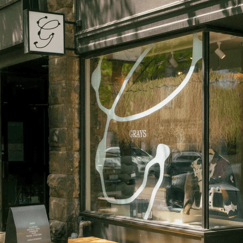
Grays: Wool as Brand Material
Grays is a fashion label and retail space on Dundas Street West in Toronto dedicated to natural Ontario wool. The brand ran for about a year before commissioning an identity — they knew what they were before they knew what they looked like.
Newkid built the identity directly from the material. Thread-like motifs and woven textures run across packaging, signage, and storytelling. The visual language is calm, tactile, and deliberately minimal — craft and sustainability communicated through texture rather than messaging.
The restraint makes sense here. Grays' differentiator isn't a clever positioning statement. It's wool. Ontario wool, specifically — local, natural, traceable. The identity lets the material speak by getting out of its way: textured packaging, clean layouts, a "nice feeling" that you sense before you read anything. In a category drowning in sustainability claims, Grays just shows you the thread.
437: Ten Years From Activewear to Lifestyle
437 launched in 2016 from a university house at 437 Johnson Avenue, funded with personal savings. The name itself is a system: "437" maps to a structure of 4-letter, 3-letter, and 7-letter words — "form" and "fashion," among others. A decade later, the brand has been spotted on Jennifer Lopez, Kylie Jenner, Bella Hadid, Sydney Sweeney, and others. Co-founders Hyla Nayeri and Adrien Bettio needed newkid to mark the ten-year milestone with a brand evolution.
The shift is from activewear to aspirational lifestyle fashion. Newkid's refresh leans into timeless editorial aesthetics and emotive storytelling centered on the feminine experience — less performance messaging, more mood and narrative. The website redesign follows the same logic: less catalog, more editorial.
It's a smart pivot at the right moment. A decade is long enough to have earned an audience but short enough that the brand isn't locked into its origin story. The new direction doesn't erase where 437 came from. It just suggests where it's going.
What Connects These Five
Restraint. Every project this week resists the obvious move.
On could have built a flashy pop-up in Shenzhen. They built permanent fixtures instead. Bleed could have made Sanity's identity feel purely technical. They held space for warmth. A Friend Of Mine could have made Six Six look like every other minimalist eyewear brand. They built a temple. Newkid could have made Grays shout about sustainability or made 437's tenth anniversary feel like a rebrand. They did neither.
The hardest design decision is often not what to add, but what to resist adding.
The projects that last tend to be the ones where someone said "no" at the right moment. This week's cases are full of those moments.