A book about graphic design can be read twice: first for its text and images, then for the way they are arranged. Page size, margins, the sequence of spreads and the binding also tell a story. This is particularly clear in the work of publishers for whom making a book is part of the conversation about design.
Niggli and ABC Verlag offer an introduction to Swiss graphic design and its professional vocabulary. Hyphen Press connects typography with history and critical reflection. Lars Müller Publishers brings important documents back into circulation and reveals the process of designing. Roma Publications explores the book as an artistic form in its own right. Their programmes extend beyond these five descriptions, but ten particular editions make the differences tangible without a long list of names.
In the readings below, a grid means the system of alignments, columns and spaces that connects the elements of a page. Typography shapes how text looks and reads: its size, weight, line length and spacing. Interior spreads let us see these decisions working together. The analysis concerns the pages shown; the photographs do not establish the exact typefaces or specifications of the original layouts.
Niggli and the Structure of Graphic Language
Switzerland. Founded by Arthur Niggli in 1950.
Starting in Teufen, Niggli published books on architecture and art; typography and graphic design became important parts of its programme. Its catalogue still brings together professional manuals, studies and monographs. Among its best-known titles is Josef Müller-Brockmann’s Grid Systems in Graphic Design. To get to know the publisher, however, it is also useful to look at books whose page organisation can be studied through their own construction. Publisher history, Niggli catalogue.
Die neue Graphik
Karl Gerstner and Markus Kutter, 1959.
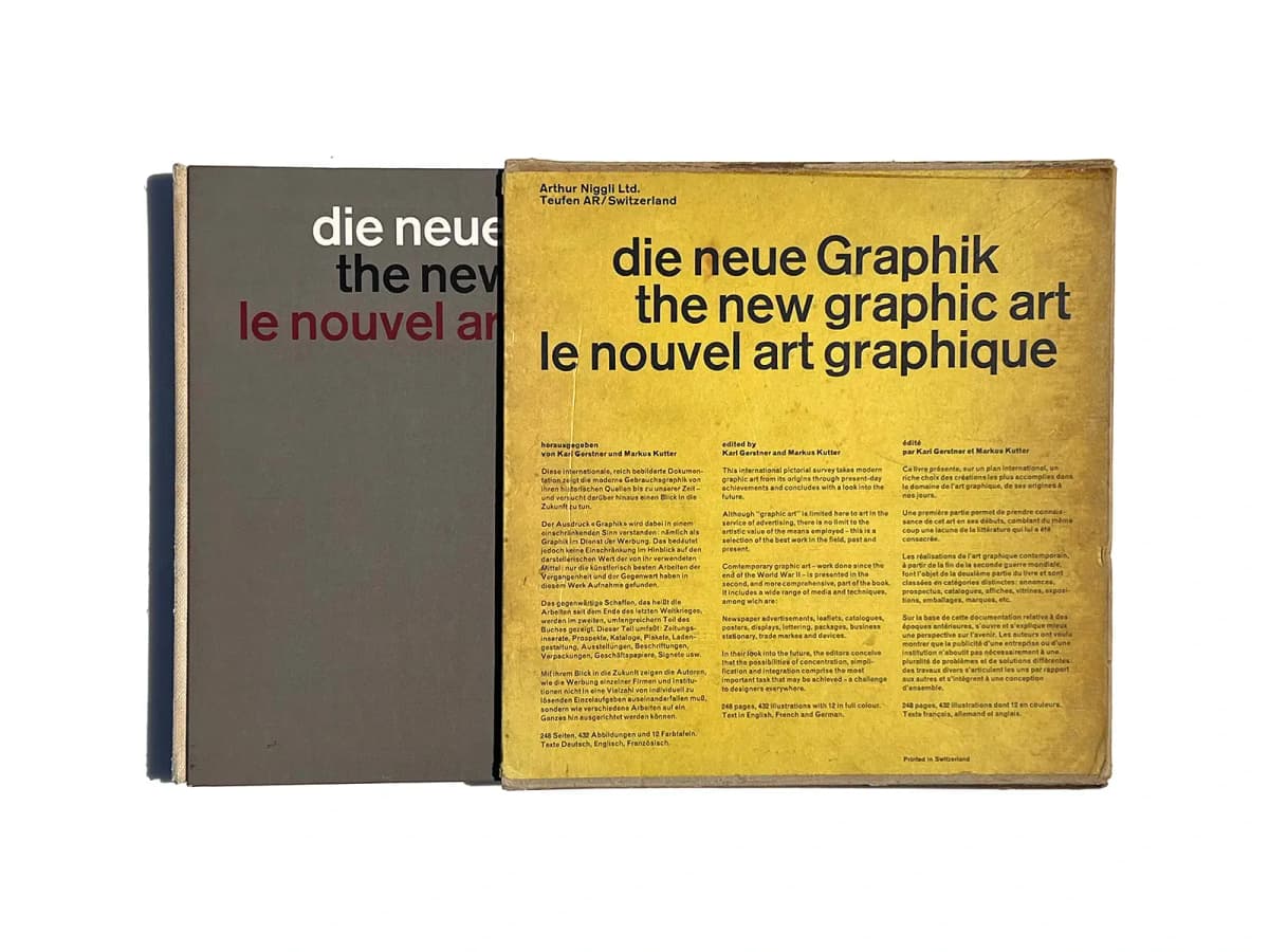
Die neue Graphik, book and slipcase. Photograph of the copy: PAGE SPREAD.
The title appears in three languages: German, English and French. The slipcase already makes translation a compositional problem: three text blocks must retain their independence while forming a whole. Designed by Karl Gerstner, the book addresses the development of modern graphic design. Its authorship, design and date are documented in the Design Reviewed archive.
A useful starting question is how readers know where to find the information they need. The large title, recurring text positions and coordinated spacing provide an answer before reading begins. A historical book can therefore remain practical material for someone designing a multilingual website, catalogue or wayfinding system.
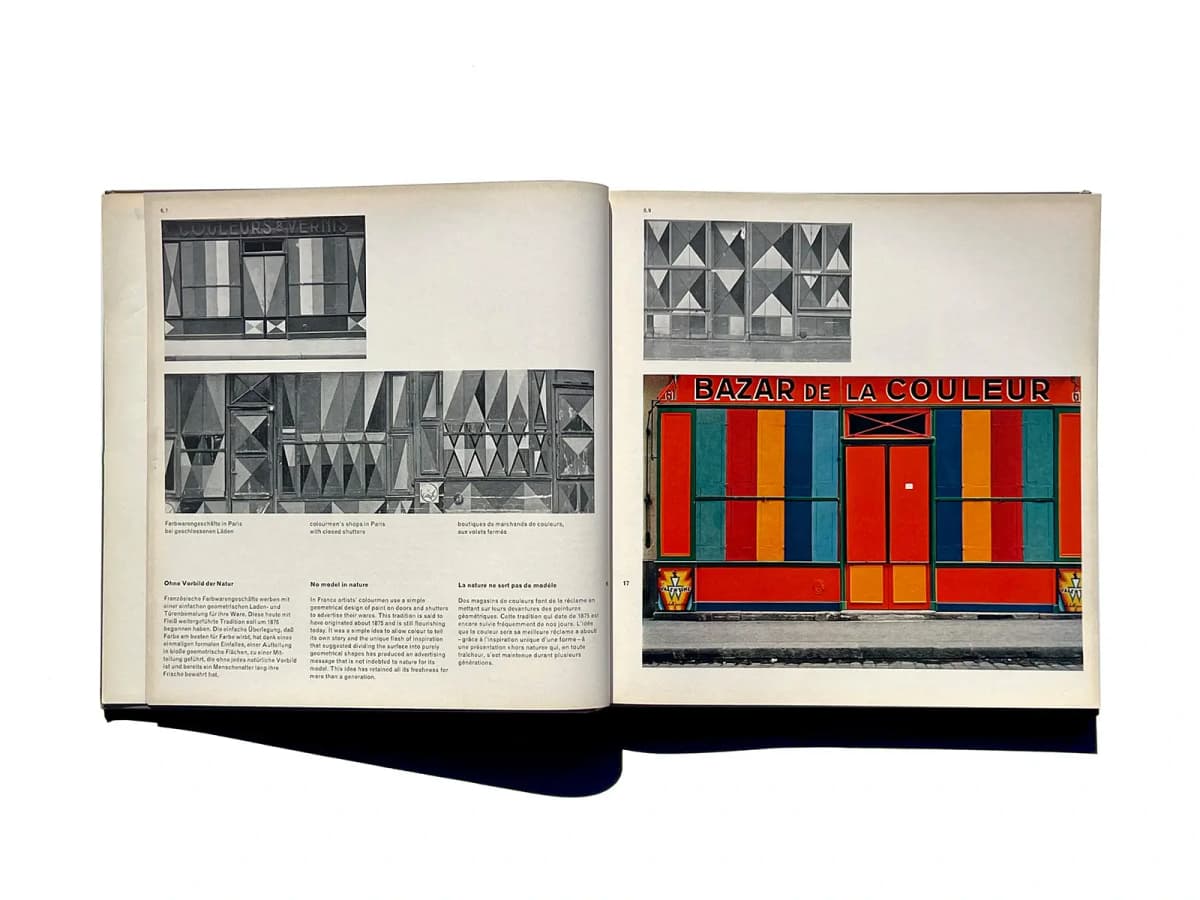
Die neue Graphik: a spread showing Parisian paint shops. Three language columns sit beneath a photograph, with a large colour image on the right. Photograph: PAGE SPREAD.
The relationship between grid and content is particularly clear in this spread. Beneath the wide black-and-white photograph are three columns: German, English and French. The captions above them follow the same order. Readers do not have to search for their language each time: its horizontal position is fixed. Headings are distinguished by weight, while the body text uses a lighter sans serif. This tonal difference establishes hierarchy without large decorative headings.
The photographs, meanwhile, are not confined to identical cells. Small images at the top leave open space to their right; wider ones occupy almost the full page width. The coloured facade on the right becomes the most prominent element. Repeated edges and horizontal alignments hold the composition together, while changes in scale direct attention. The grid establishes relationships between elements, allowing an image to occupy different numbers of underlying modules.
Jost Hochuli Printed Matter Mainly Books
Jost Hochuli. An edition from the early 2000s.
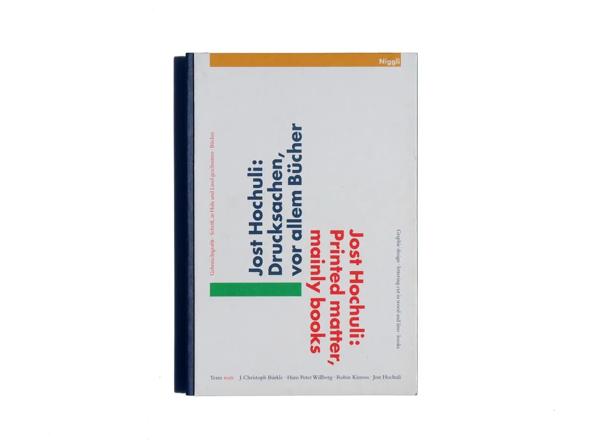
A monograph on Jost Hochuli’s printed work. Photograph: PAGE SPREAD.
On the white cover, the German and English titles are rotated away from the usual reading direction. Colour separates the languages, while small bars help balance the composition. The book itself concerns exacting work with proportion, typesetting, rhythm and the organisation of the printed page. Niggli’s description.
Alongside Gerstner, Hochuli demonstrates the variety within the Swiss tradition. Attention to order does not require every book to look alike. It asks that each decision be examined: is the line comfortable to read, is the hierarchy clear, and does the spacing help distinguish the parts of the text?
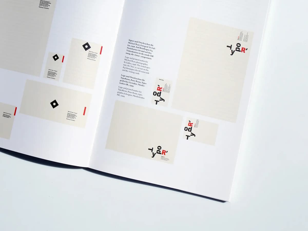
Printed Matter Mainly Books: stationery for Michael Rast and TypoRenn, bilingual captions and open spaces between objects. Photograph: PAGE SPREAD.
The spread brings together letterheads, envelopes and cards. Their proportions differ, so reproducing everything at an identical size would distort our understanding of the set. Here, a tall letterhead, a wide envelope and a small card retain their distinct formats. White intervals give each object a boundary, making a thin frame around every reproduction unnecessary.
In the narrow text area, the German description is followed by English. The captions use a serif typeface. The objects themselves feature sans-serif marks and freely arranged letters. This creates two levels of typography: the book’s calm explanatory voice and the individual voice of the project it presents. It is important to keep them separate when analysing the spread: the TypoRenn lettering belongs to the reproduced identity, while the adjacent caption belongs to the monograph’s design.
ABC Verlag and Collections of Visual Solutions
Switzerland, Zurich. Books from the 1960s to the 1980s.
Catalogues use both ABC Verlag and ABC Edition. These are language variants of the same Zurich publisher’s name, sometimes appearing together on multilingual title pages. Its books address graphics, advertising, symbols, colour and art. Its publications and activity are documented, among other places, in the Swiss National Library’s archive and a bibliographic handbook reproducing a title page.
Two books by Walter Diethelm show how a publishing series can turn separate subjects into a sequence of lessons. Their similar formats and related covers make the connection visible before the reader opens either book.
Signet Signal Symbol
Walter Diethelm. Second edition, 1972.
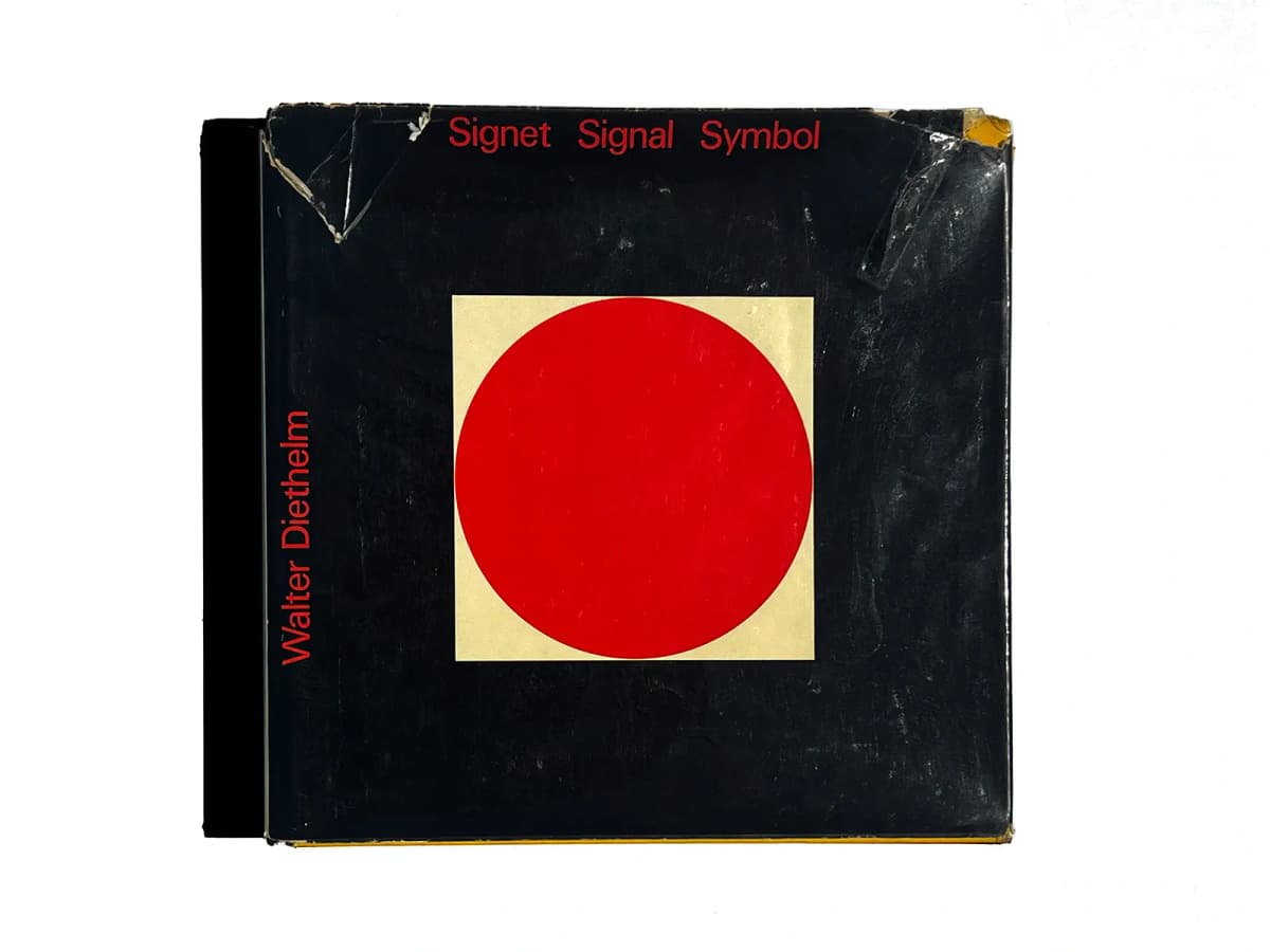
Signet Signal Symbol. The photograph shows wear on this particular copy’s dust jacket. Source: PAGE SPREAD.
A red circle sits inside a pale square on a black field. The cover suggests the difference between a simple geometric shape and a sign given expression through composition. The book presents signs from around the world; the copy shown belongs to the second edition of 1972. Bibliographic confirmation.
Collections like this reward comparison. What survives when an image is reduced? How does the space inside a shape affect recognition? When does a drawing become simple enough to function as an emblem? These questions turn browsing a catalogue into an exercise in observation.
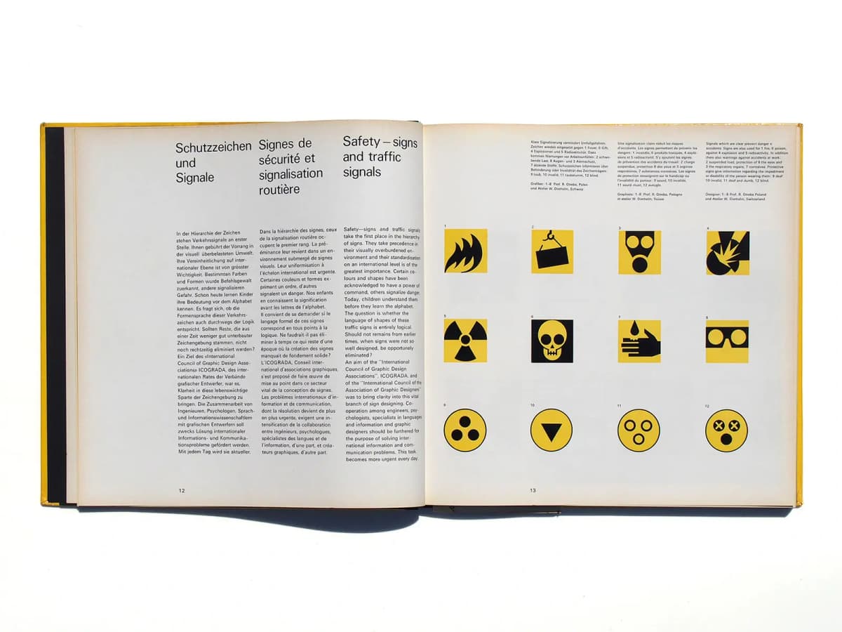
Signet Signal Symbol, pages 12–13: three languages on the left and twelve safety signs arranged in four columns and three rows on the right. Photograph: PAGE SPREAD.
On pages 12–13, text and images follow two different grids. On the left are three narrow language columns with large headings. The French heading takes more lines, yet the body text begins at roughly the same horizontal level as the German and English. A generous gap separates headings from text, preventing differences in translation length from disrupting the page’s overall order.
On the right, twelve signs form four columns and three rows. Numbers connect the images with the explanations above. Similar scale and regular spacing make it possible to compare silhouettes, the proportion of black and the shapes of internal spaces without being distracted by arbitrary image sizes. The columns of explanation do not correspond one-to-one with the columns of signs. Several coordinated structures serve different tasks: reading a translation, locating a numbered item and comparing images.
Form + Communication
Walter Diethelm, 1974.
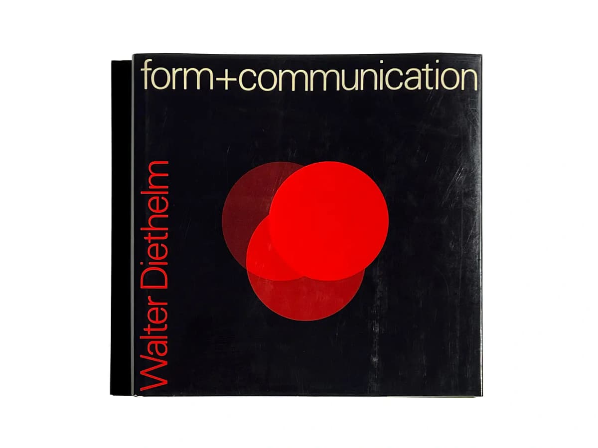
Form + Communication. Photograph: PAGE SPREAD.
On this cover, the circle is repeated: three intersecting forms create new areas and change the sense of depth. Its relationship to Signet Signal Symbol is clear, but a single sign gives way to relationships between elements.
This is a useful pair for a beginning designer. First, examine the silhouette and contrast of one shape, then the repetition, overlap and grouping of several. Reading the covers this way does not replace the books’ contents, but it shows how a series can begin teaching before the first spread.
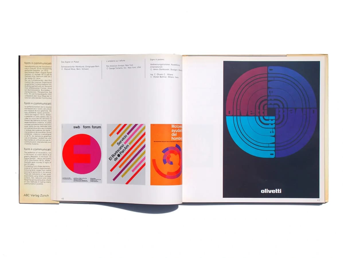
Form + Communication, pages 42–43: three small posters on the left and a large Olivetti reproduction on the right. Photograph: PAGE SPREAD.
On pages 42–43, three small posters form a row near the bottom of the left page. Brief project details sit at the top, divided by thin vertical rules. The large space between text and images has a clear purpose: it separates reference information from the visual sequence. The Olivetti poster on the right occupies almost the whole page, introducing another scale of viewing.
Two design decisions can be studied here. The book’s layout sets up a comparison between three examples and gives the fourth emphasis through size. Within the Olivetti poster itself, letters are integrated into a circular system of bands: the word becomes part of the image. The small white logo at the bottom remains readily legible. Experimental lettering and a clear identification of the sender perform different roles within the same poster.
Hyphen Press and Typography as a Subject of Thought
United Kingdom. New books appeared from 1980 to 2017.
Robin Kinross began Hyphen Press with a new edition of Norman Potter’s What is a designer. The publisher subsequently focused on typography in relation to history, culture and working practice. Its last new book appeared in 2017; it continues to sell remaining stock and publish material on its website, but does not plan further reprints. Hyphen Press history.
The editor’s role is particularly apparent here. Collecting a designer’s work is not enough: someone must decide which documents will help explain it, where commentary is needed and how professional activity connects with a life.
Anthony Froshaug
Typography & texts / Documents of a life. Edited by Robin Kinross, 2000.
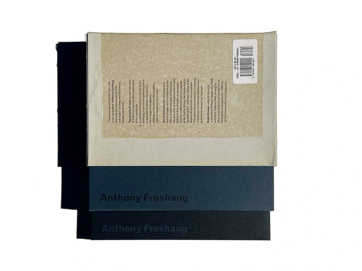
The two volumes and slipcase of the Anthony Froshaug publication. Photograph: PAGE SPREAD.
The two-volume structure separates work and writing from documents of a life. Readers can compare the results with the circumstances in which they emerged. The publication brings together Froshaug’s published articles and texts that had remained in manuscript; Hyphen Press later made one of them available on its website.
This changes how the profession is viewed. Typography emerges as a sequence of decisions, discussions and attempts to explain one’s work. The restrained design of the two volumes supports their research character: attention gradually moves from the physical object to the documents within.
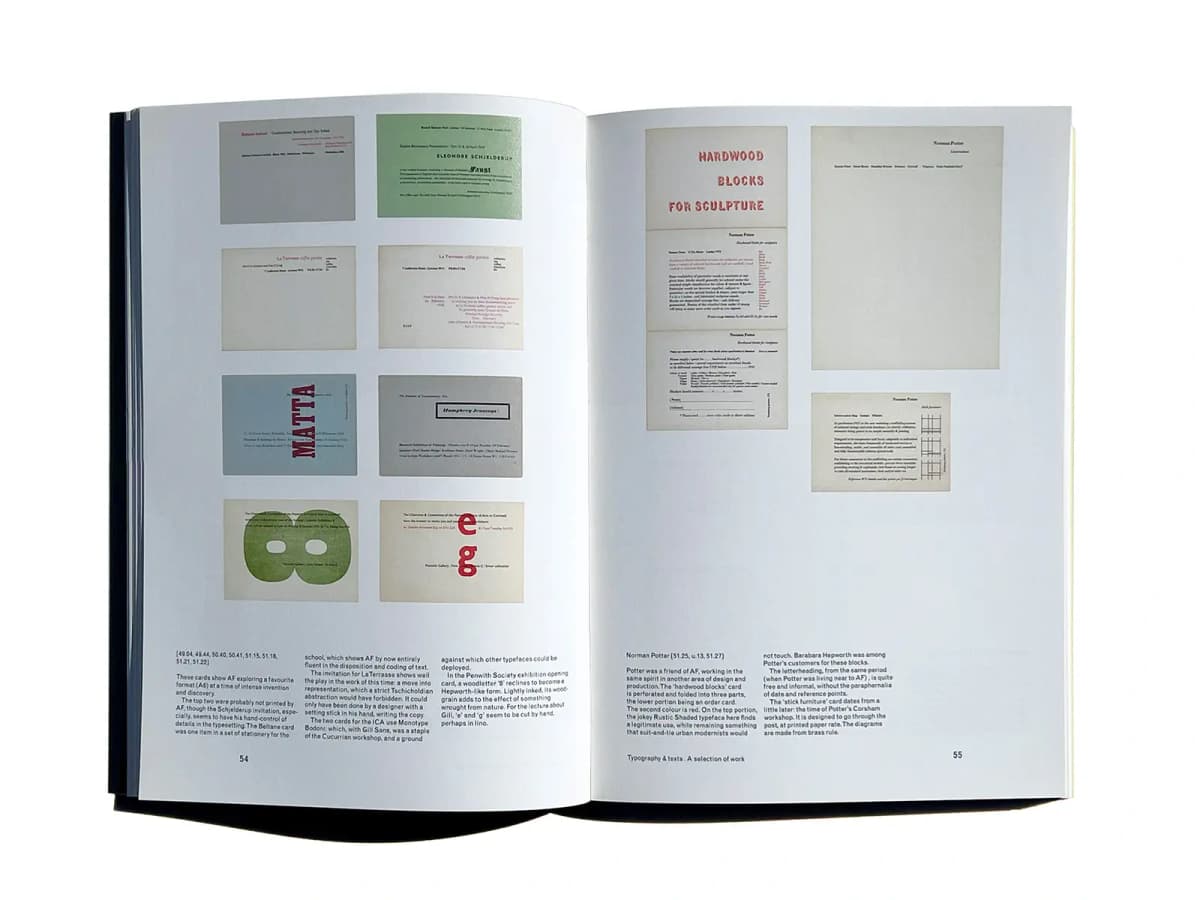
Anthony Froshaug, pages 54–55: cards and printed sheets above a separate band of editorial commentary. Photograph: PAGE SPREAD.
On pages 54–55, the left page contains eight cards arranged in two columns. The right presents objects of other proportions: a vertical sequence of printed fragments, a tall sheet and a small card. They are not stretched to fit a single format. Alignment and spacing establish a shared order while leaving the documents’ original proportions visible.
Commentary runs along the bottom in short columns. On the left page, the editorial text occupies three columns even though the images above are arranged in two. This is a useful distinction: the reproduction grid supports comparison between objects, while the text grid provides a comfortable line length. Page numbers and the section title occupy separate positions below. Readers can distinguish document, explanation and navigation even when all three levels use small type.
Karel Martens Printed Matter / Drukwerk
Karel Martens. Second edition, 2002.
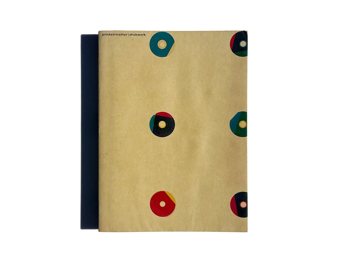
Printed Matter / Drukwerk, second edition. Photograph: PAGE SPREAD.
Coloured ring-shaped impressions sit on the light-brown cover. Their overlaps can be read as small experiments in colour and misalignment. The concise title leaves almost the entire surface to these relationships.
The appearance of the new edition in 2002 is recorded in the Hyphen Press journal. The book’s later life also matters: an expanded version would eventually appear with Roma Publications. One artist’s history connects two publishers with different programmes and shows how a monograph can grow alongside an artistic practice.
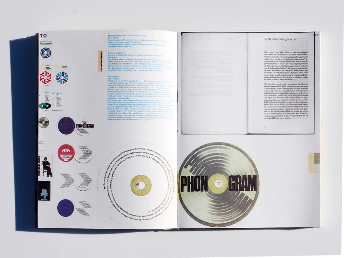
Printed Matter / Drukwerk: a spread of Phonogram work with blue commentary and large circular reproductions. Photograph: PAGE SPREAD.
In the Phonogram spread, small reproductions run down the left edge, blue text forms a separate block closer to the centre, and two large circles occupy the bottom. Another book spread appears at the top right. Scale becomes a means of explanation: a series of objects is visible first, then individual details can be examined more closely.
Blue distinguishes the editorial commentary from text within the reproduced works. The circular lettering around the disc and the narrow rectangular setting in the book on the right belong to Martens’s projects themselves. The monograph allows these approaches to typesetting to be compared on one plane. Its apparently free composition still has anchors: the vertical sequence of small examples, the rectangle of commentary and the pair of large circles. These repetitions help the eye make sense of a complex spread.
Lars Müller Publishers and a Return to the Sources
Switzerland. Founded in 1983.
Lars Müller came to publishing from graphic design. His first book was Die gute Form; supporters of his work included Richard Paul Lohse and Josef Müller-Brockmann. Architecture, design, art and photography form a broad programme in which preserving important historical material has a prominent place. Publisher history.
The next two examples offer different approaches to preservation. One returns a magazine to readers in its original sequence. The other reconstructs a studio’s work through its intermediate stages.
Neue Grafik / New Graphic Design / Graphisme actuel
Facsimile edition, 2014. Original magazine published 1958–1965.
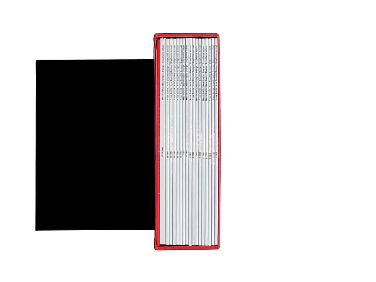
The Neue Grafik issues in their slipcase. Photograph: PAGE SPREAD.
Lars Müller Publishers reissued all 18 issues with additional commentary. A facsimile reproduces an original publication so that its pages and sequence of material can be studied. The dates 1958–1965 refer to the magazine; 2014 refers to the set shown here. Publisher catalogue.
This is the format’s value for research: readers see the context around famous spreads, including repetition, changes of pace and the juxtaposition of text and images. Neue Grafik should not be confused with Gerstner and Kutter’s Die neue Graphik: the similar titles refer to a magazine and a separate book.
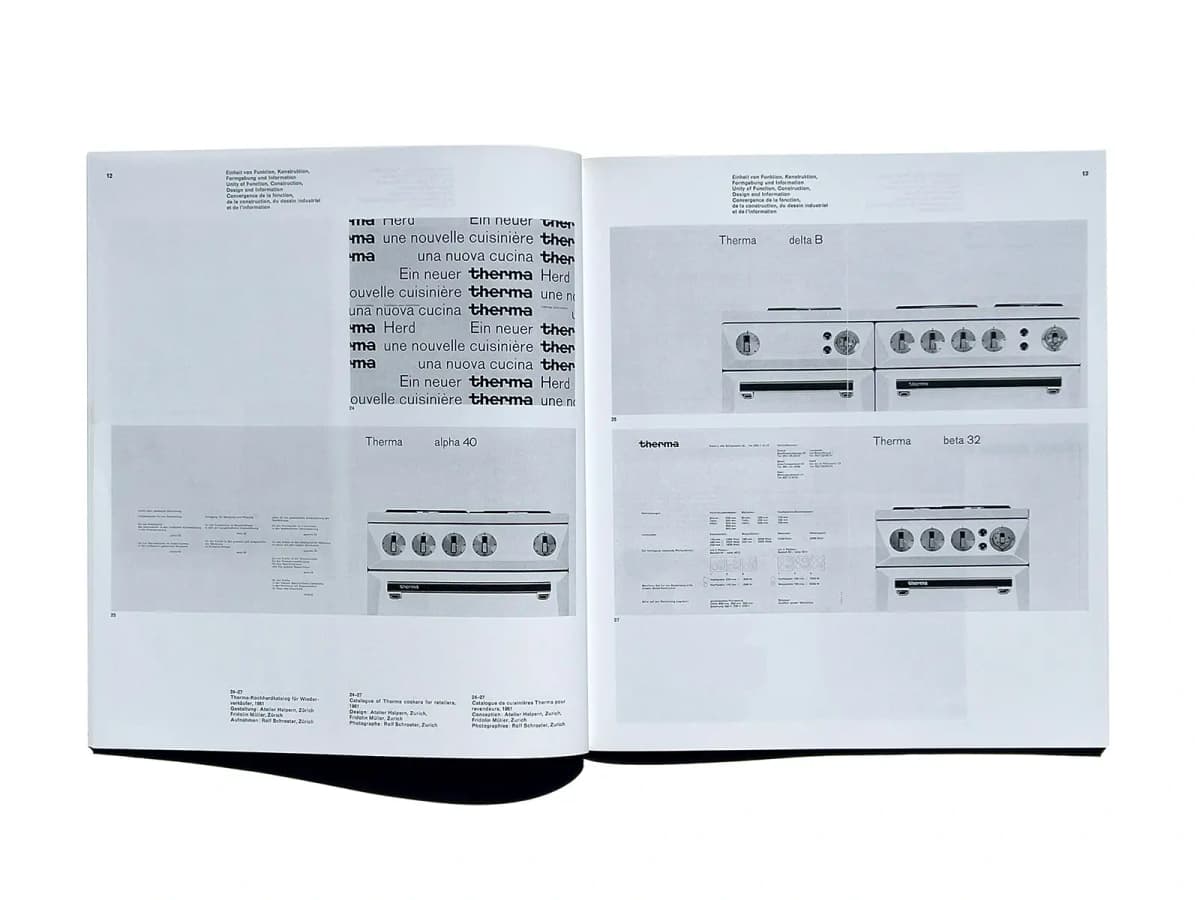
Neue Grafik, pages 12–13 of one issue: reproductions of a Therma catalogue and compact captions in three languages. Photograph: PAGE SPREAD.
In the spread showing a catalogue of Therma cookers, it is important to distinguish the magazine’s grid from the design of the catalogue it reproduces. The magazine arranges reproductions in large rectangular blocks: one occupies part of the upper left half, while others span the page width. Outer edges, horizontal intervals and compact captions hold these different sizes together. Open space at the upper left balances the denser lower area.
The project caption sits at the bottom of the left page in three language blocks. A restrained sans serif at a small size separates reference information from images. Within the reproductions themselves, the Therma name, product photographs and technical information recur. This offers a lesson at two scales: the magazine organises an account of a project, while the catalogue within it organises information about a product. The facsimile makes both decisions available for study at once.
8vo On the Outside
Hamish Muir and Mark Holt, 2005.
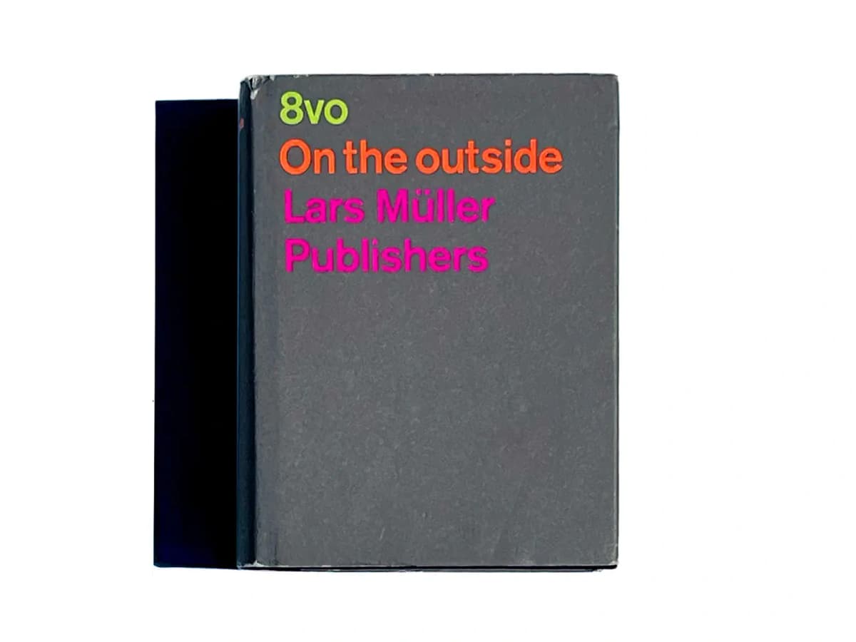
8vo: On the Outside. Photograph: PAGE SPREAD.
This small book, measuring 12 × 16 centimetres, contains 536 pages. It covers the work of the studio 8vo from 1984 to 2001, including the magazine Octavo. Its authors show intermediate layouts and discuss working with clients, typesetters, printers and computers. Publisher’s description.
It can therefore be read as a history of the transition from manual artwork preparation to desktop publishing. Finished work usually conceals the chain of decisions behind it. Here, that chain becomes the book’s content, revealing the tools and constraints the designers had to work with.
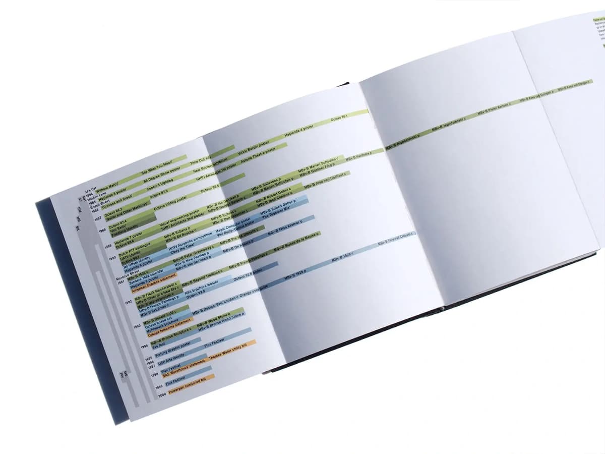
8vo On the Outside: a fold-out project chronology with years along the left edge and titles on coloured bands. Photograph: PAGE SPREAD.
The photograph shows a chronological diagram opened out across additional folds. Years run along the left edge, while project titles sit on horizontal coloured bands; some lines extend far to the right. Readers can follow an individual line or scan the sequence of years. The small sans-serif type works as diagram labelling: short titles are attached to their bands rather than forming a continuous paragraph.
The change in the physical width is particularly revealing. A normal page in this pocket format would be too narrow for the diagram, so it is extended. The folds become part of the reading process. A single photograph cannot reliably establish what every colour means, but it clearly shows how colour separates neighbouring entries and a shared horizontal line connects distant areas. The book’s construction directly supports the presentation of information.
Roma Publications and the Book as an Artwork
The Netherlands, Amsterdam. Founded in 1998.
Roma was established by graphic designer Roger Willems and artists Mark Manders and Marc Nagtzaam. The publisher works with artists, writers and institutions, choosing a format and method of distribution for each project. Its practice includes books, newspapers and other printed forms. About Roma Publications.
Part of this programme consists of artists’ books: publications that are themselves artworks. Monographs and documentary books serve a different purpose, but selection, page sequence and physical interaction matter in them too. Two books about Martens demonstrate how closely a publication’s content can relate to its form.
Karel Martens Full Color
2013.
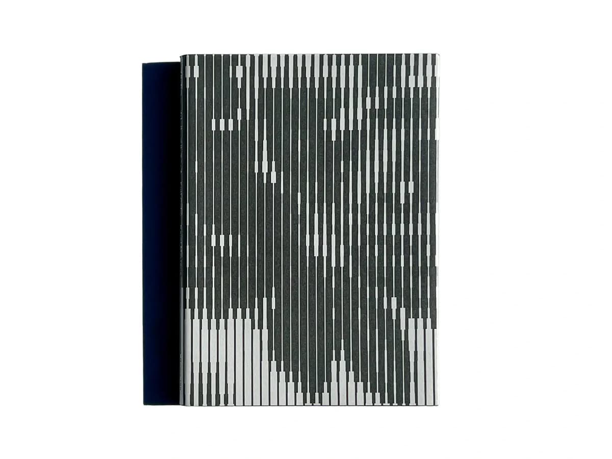
Full Color. Cover photograph: PAGE SPREAD.
Despite its title, the cover is almost monochrome: vertical stripes vary in thickness to create an optical rhythm. Inside is a photographic essay on Martens’s studio, prepared for the exhibition KM at Tokyo’s ginza graphic gallery. The photographs are by Johannes Schwartz, with texts by David Senior and Martens himself. Publication record with information supplied by Roma.
The choice of material shifts attention from finished work to the environment in which it emerges. The studio can be viewed as a structure for memory: objects, samples and images remain close at hand and enter new combinations. For readers, it is an invitation to observe their own workspace.
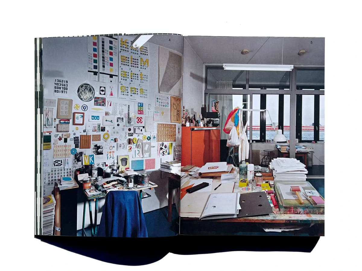
Full Color, pages 4–5: a studio photograph fills the spread, with page numbers printed over the image. Photograph: PAGE SPREAD.
On pages 4–5, the studio photograph fills the entire spread, running to the edges of the pages. There is no separate caption area; the numbers 4 and 5 are printed directly over the upper part of the image. The book’s typography almost withdraws, leaving the reader with the studio itself: the wall of samples, tables, papers and tools.
Here it is useful to separate the photograph’s composition from the publication’s grid. The many rectangles on the wall create a rhythm within the image, but they are not layout columns. The book’s design decisions concern the image’s scale, its position in relation to the fold and the minimal navigation. The gutter passes through the scene as the eye continues from the left page to the right. The spread works as a single field; this approach requires particular attention to the details that fall into the fold.
Karel Martens Re-Printed Matter
Fourth, expanded edition, 2019.
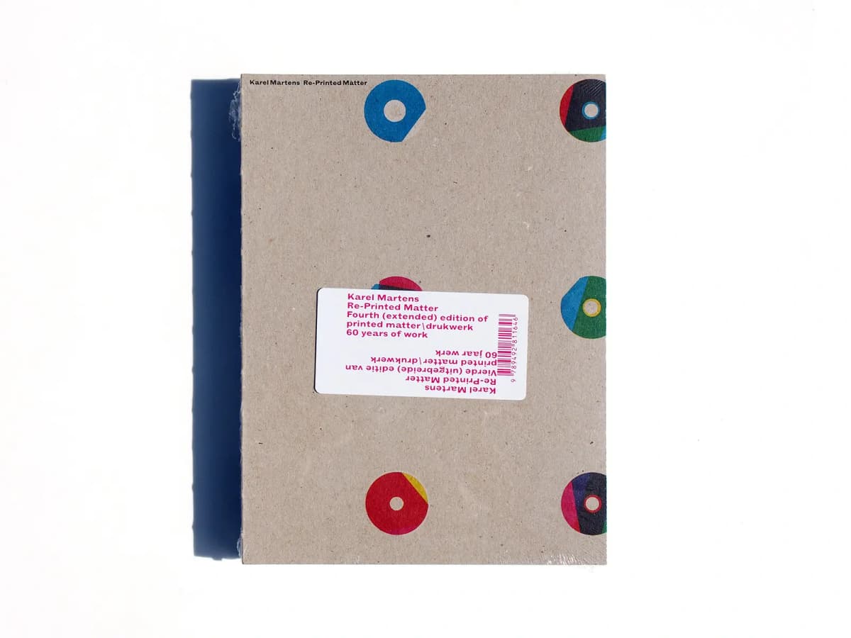
Re-Printed Matter. Photograph: PAGE SPREAD.
The familiar coloured rings return on the cover. The fourth edition of the monograph covers almost six decades of Martens’s work and was designed by Karel Martens and Jaap van Triest. The first version appeared in 1996; the Roma edition extends the material to 2019. Publication record.
Placing the 2002 Hyphen Press copy beside Roma’s 2019 edition makes the history of revision visible. The recognisable composition remains, while the title and extent change. The book continues to live as an editable collection of work that can be expanded and presented anew.
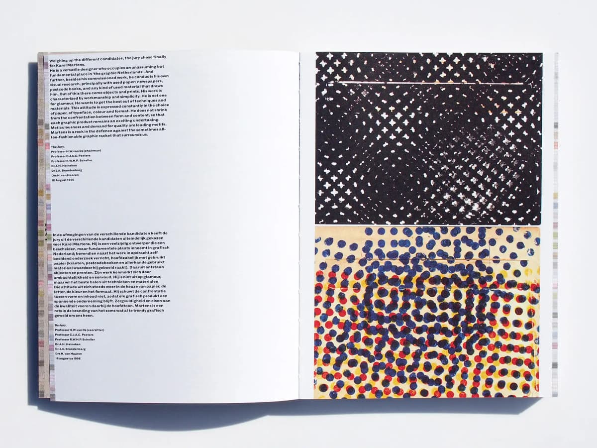
Re-Printed Matter: English and Dutch texts on the left, with two dense reproductions of prints on the right. Photograph: PAGE SPREAD.
On this spread, two language blocks sit one above the other along the left edge. A wide white area separates them from the page’s right boundary. The text uses a relatively heavy, compact sans serif: even at a small size, it forms an assertive dark mass. Two reproductions almost fill the right page, black-and-white above and colour below, separated by a narrow horizontal interval.
The amount of content is not symmetrical: the left page is sparse, the right dense. Balance emerges between the compact text blocks and the densely patterned surfaces of the prints. Unlike Gerstner’s parallel language columns, Martens’s translations are grouped vertically. Comparing these books shows how the same task—accommodating two or three languages—can produce different grids and different reading rhythms.
From Niggli to Roma: Reading a Book’s Design
Start with a pair rather than an entire catalogue. At ABC Verlag, compare a single circle with several intersecting forms. At Niggli, compare Gerstner’s multilingual organisation of information with Hochuli’s rotated titles. At Lars Müller, compare the reproduction of a historical magazine with an account of a studio’s working process.
Then move from cover to spread. Where does reading begin? How does a caption relate to its image? Why does one photograph occupy a page while another sits among several? What happens to the pace when a dense spread is followed by an almost empty one? These questions reveal design decisions in what may initially seem simply a beautiful book.
Finally, read the publication details. The distinction between a first edition, an expanded version and a facsimile matters: one is a document of its time; another is a later effort to bring that document back to readers. Publishers decide what to preserve, how to explain it and in what form to pass it on. The name on a spine can therefore be a useful starting point for building a personal library.
Illustrations are photographs of copies in the PAGE SPREAD catalogue; each image is credited to its source. Dates in captions refer to the editions described. The Hochuli monograph retains the designation “early 2000s”: Niggli gives October 2001, while the library catalogue and the listing for the photographed copy give 2002. TCDC bibliographic record.